A Complete Guide to WooCommerce Checkout (And All the Plugins You Need)
David Mainayar on | 10 min read
And a lot of these cart abandonment instances happen during the checkout stage. According to one study, the average checkout abandonment rate — or the percentage of people who begin the checkout process but don't complete it — is a solid 30%. But why is it so? It's so because, during the checkout process, you need to make your users do a lot of work — like filling out their billing, shipping, and payment details. It's no wonder that 18% of users abandon a checkout because it's too long. The same research explains that if you only optimize your checkout process, you can get 35.62% more conversions, on average.
So how do you go about optimizing your checkout process? There are three parts to this. First up, you need to optimize your checkout itself. Next, you need to help people get to the checkout sooner. And finally, you need to investigate how you can simplify your checkout process for returning customers as, like all of us, they will find re-entering their checkout information annoying. This article will help you with all three steps.
A quick look at WooCommerce's default checkout setup (and why it needs optimization)
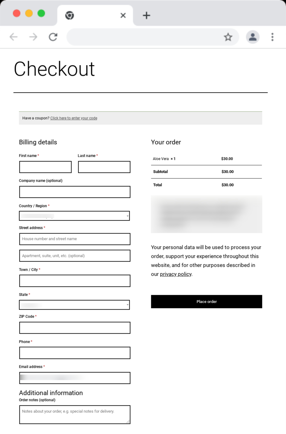
At the core of your WooCommerce — or any general eCommerce — checkout process lies its checkout page. By default, WooCommerce offers a long-form checkout page that easily overwhelms users. Here's WooCommerce's checkout page as it ships with the plugin:
One fundamental problem with WooCommerce's default checkout page
The default WooCommerce checkout page is too long and feels like a lot of work.
To start with, WooCommerce's default checkout page (form) shows users just too many form fields, of which several are compulsory.
Not to forget that in addition to the required form fields, there are over a dozen more checkout elements on your page, some of which — like the checkout's privacy policy and data usage disclaimer — are downright distracting.
On top of everything else, the default checkout page that ships with WooCommerce doesn't use a lean, conversion-focused UI.
WooCommerce's overall checkout flow, too, isn't optimized.
Three critical problems with WooCommerce's default checkout flow
1. It takes too many steps to get to the checkout.
If you map out your store's default checkout process, you'll see that you take quite a few clicks to get to the checkout process. By default, your users only get the Add to cart button on your product pages. When users add an item to their cart, they need to click the View cart button to view their cart. And then, on the cart page, they need to hit the Proceed to checkout button to get to the very long default checkout page finally!
Each click it takes to reach the checkout page can be a leak in your conversion funnel.
A lot of times, you want your users to head straight to the checkout right from the product page. In other words, in addition to the Add to cart option, you want to give your users a Buy now option, just like Amazon does. WooCommerce doesn't support this right out of the box, and placing orders takes many clicks.
2. Missing cart page functionalities.
Also, users can't edit their cart's content on the checkout page. So users need to hit the back button to change the quantity of the products in their cart or remove stuff. Essentially, the cart page functionality is missing from the checkout page, but then that's how it's designed with WooCommerce's default checkout setup.
3. Returning visitors represent another unique challenge.
Ideally, the checkout flow for returning customers should be quick as you already have their billing, shipping, and payment details. In other words: returning users must get what's called a one-click checkout where your checkout solution remembers them from their earlier visits. The most you'd need them to do is authenticate their transaction — and done. You can recall from your Amazon shopping experiences that Amazon does precisely this. In fact, Amazon pioneered this one-click checkout concept for returning visitors.
That's not all.
Another missing essential in WooCommerce's checkout page
By default, WooCommerce's checkout page and setup don't give you any upselling or cross-selling opportunities.
There's no way you can pitch related products or feature better upsells to users right when they're in the middle of making a purchase. The checkout page does nothing to improve your average order value.
Think about all the times you added items to your cart from the checkout aisle at a mall or retail store. Your online store needs this too! Upsells/cross-sells on your checkout page are some of your most effortless sales.
As you can see, the default WooCommerce default checkout can use a host of optimization techniques. So let's see how online stores go about these.
Optimizing WooCommerce's default checkout
Making WooCommerce checkout feel like less work
Optimizing form fields, eliminating distracting checkout elements, and offering a more focused layout can help more people complete the checkout process. Let's start with optimizing the checkout structure.
Exploring one-page, multi-page, and modal checkout options
To offer users a more streamlined and focused checkout experience, many online stores go with a Woocommerce one-page checkout and use a clever multi-column page template to make filling all this information look like less work than it is. They trick users into believing that the checkout is a quick thing.
Some WooCommerce stores, on the other hand, replace the default WooCommerce checkout page with a multi-page checkout template. The first page typically shows billing fields and collects a user's billing information. The second one offers shipping fields for collecting their shipping information. And the third prompts users to enter their payment details. And so on. The idea is to get users to the payment stage without even realizing it.
When done right, both one-page and multi-page WooCommerce checkouts can work well. However, these get poorly implemented most of the time. For example, a one-page WooCommerce checkout can feel like it's cramming just too much on a single page. It's also not always easy to have users perceive filling the form as a quick, effortless job. Likewise, a multi-page WooCommerce checkout can feel too long and winding. Not to forget its impact on the time it takes to complete the checkout. Additional page loads can add a few seconds to your checkout process. Remember that users are quick to abandon a slow checkout.
On average, a checkout has 23.48 checkout form elements, of which 14.88 are form fields. Now, as you can imagine, this is a LOT to stuff into a single page.
The third (and the best option) to implement a WooCommerce checkout page is to entirely replace it with a checkout popup window or a modal. Instead of implementing a one-page or multi-page checkout on your WooCommerce store, just add a window checkout — one that pops up in a flash, uses the best conversion rate optimization hacks (including using just the correct number of form fields), and splits up the checkout process so it's easy to complete!
Here are a few plugins to implement one-page, multi-page, and modal checkouts:
-
PeachPay: PeachPay offers a slick modal checkout window that collects all the information you need to process your checkout in a lightweight popup. More on this below.
-
WooCommerce One Page Checkout: WooCommerce's official one-page checkout extension lets you add a checkout form to any page or post on your store. Just drop the plugin's shortcode into, say, a custom landing page, and your checkout will show up on it with just a click! All your users need to do is fill it out and hit the payment button.
-
YITH WooCommerce Multi-step Checkout: This plugin comes with ten multi-page — or rather said, multi-step — WooCommerce checkout layouts that let you split your checkout process and show it to the users one section at a time. By default, there are five steps to checkout with this plugin, including logging in (or opting for a guest checkout), entering billing information, inputting a shipping address, confirming order info, and making the payment. This workflow can be customized, though.
Optimizing form fields and checkout elements
If you review WooCommerce's compulsory checkout fields, you'll see that you can easily get rid of the second address field, as most eCommerce stores can do without it. You can also remove the phone number field if it makes sense.
Of the optional form fields, too, you can remove order notes.
If you must keep the coupon field, you can give a direct field to enter the coupon code rather than adding one more click to the checkout workflow and needing users to click the Click here to enter your code and then the Apply coupon button.
By default, WooCommerce doesn't offer you any way to customize your checkout form fields. So if you want to make any changes to your form fields, you need to use a WooCommerce checkout form field editor plugin or write custom code. If you're looking to customize your WooCommerce form fields, here are three good plugins:
-
PeachPay: By default, PeachPay offers you a more streamlined form with fewer form fields and elements. Also, you can use PeachPay to eliminate your form's order notes and coupon fields with a few clicks. You can even add new text fields, if you need.
-
Checkout Field Editor: This is a more complete WooCommerce checkout form field editor plugin. It lets you remove WooCommerce's compulsory and optional fields, add new fields for accepting different types of inputs, and change labels, among other things.
-
YITH WooCommerce Checkout Manager: This is yet another WooCommerce plugin that lets you edit your checkout form's default fields and add custom field types like radio buttons.
In addition to editing WooCommerce checkout fields to make the checkout form shorter, many store owners also eliminate the privacy text/disclaimer and policy text altogether to make the checkout feel leaner. These plugins helps with that too.
Optimizing the general checkout flow
Ideally, no matter where your users are inside your store, they should only be a click away from your checkout. Here are a few plugins to allow such a one-click-to-the-checkout checkout flow:
-
PeachPay: PeachPay adds an express checkout button to every single product page on your WooCommerce store. If a user clicks this button, they're shown the checkout option and aren't taken to the shopping cart page anymore. You can save a lot of cart abandonment instances by reducing the number of steps to the checkout in this way.
-
Direct Checkout for WooCommerce: When users click the Add to cart button on your WooCommerce store, this plugin takes them to the checkout page. It can also add a "Purchase Now'' button to each of your product pages.
-
Direct checkout, Add to cart redirect, Quick purchase button, Buy now button, Quick View button for WooCommerce: This plugin implements a redirect and takes the traffic to your cart page directly to your checkout page, thereby simplifying the checkout process and optimizing the number of steps it takes to get to the checkout.
Bringing upsells and cross-sells to the default WooCommerce checkout page
To truly optimize your checkout experience and make more sales and revenue, you have to add upselling and cross-selling to your checkout page too. WooCommerce doesn't bring this functionality by default. But you can add it via plugins. Here are a few to help you:
-
PeachPay: With PeachPay, you can add a one-click upsell or cross-sell directly to your checkout window. A user can add your upsell to their cart with just one click.
-
Upsell Order Bump Offer for WooCommerce: This is yet another WooCommerce plugin that lets you display an order bump offer on your checkout page.
-
Download Checkout Upsell Funnel for WooCommerce: This WooCommerce extension lets you offer product suggestions and order bump offers on your checkout page. You can easily customize your offer's featured image, copy, title, etc.
As you just saw, optimizing WooCommerce's default checkout page, flow, and process, in general, takes you to a host of different (premium) WooCommerce add-ons/extensions. Installing so many extensions and getting them to work together and maintaining the complex infrastructures you end up with is time-, effort-, and resource-intensive. What if you had just one plugin to take care of it all for you? Meet PeachPay.
Meet PeachPay: A WooCommerce checkout plugin that does it all
If you want to use a single checkout solution and optimize your entire WooCommerce checkout process and work on everything from the checkout flow to the checkout interface, pick PeachPay. Backed by Automattic (WooCommerce's parent company) PeachPay completely overhauls WooCommerce's default checkout. It brings many functionalities to help a WooCommerce store bring down its cart abandonment rate and recover revenue that is lost to it.
PeachPay adds a slick window checkout to your WooCommerce stores to help first-time users fill the checkout fields without feeling overwhelmed.
When a user makes their first purchase on your WooCommerce store, you have to show them a multi-field form. You need to collect their name and surname, ask for their address (and confirm if their shipping address is the same as their billing address), and prompt them to enter their credit card information. There's no way you can bypass all these checkout form fields for your first-time buyers. Even optimized forms use 10 fields, on average, with several additional elements (like placeholder texts, input validation remarks, among others).
Understandably, the checkout page looks like a lot of work, with its form needing users to fill out a lot of information. But PeachPay makes filling this information effortless with a slick two-step checkout modal. Below, you can see PeachPay's checkout window:
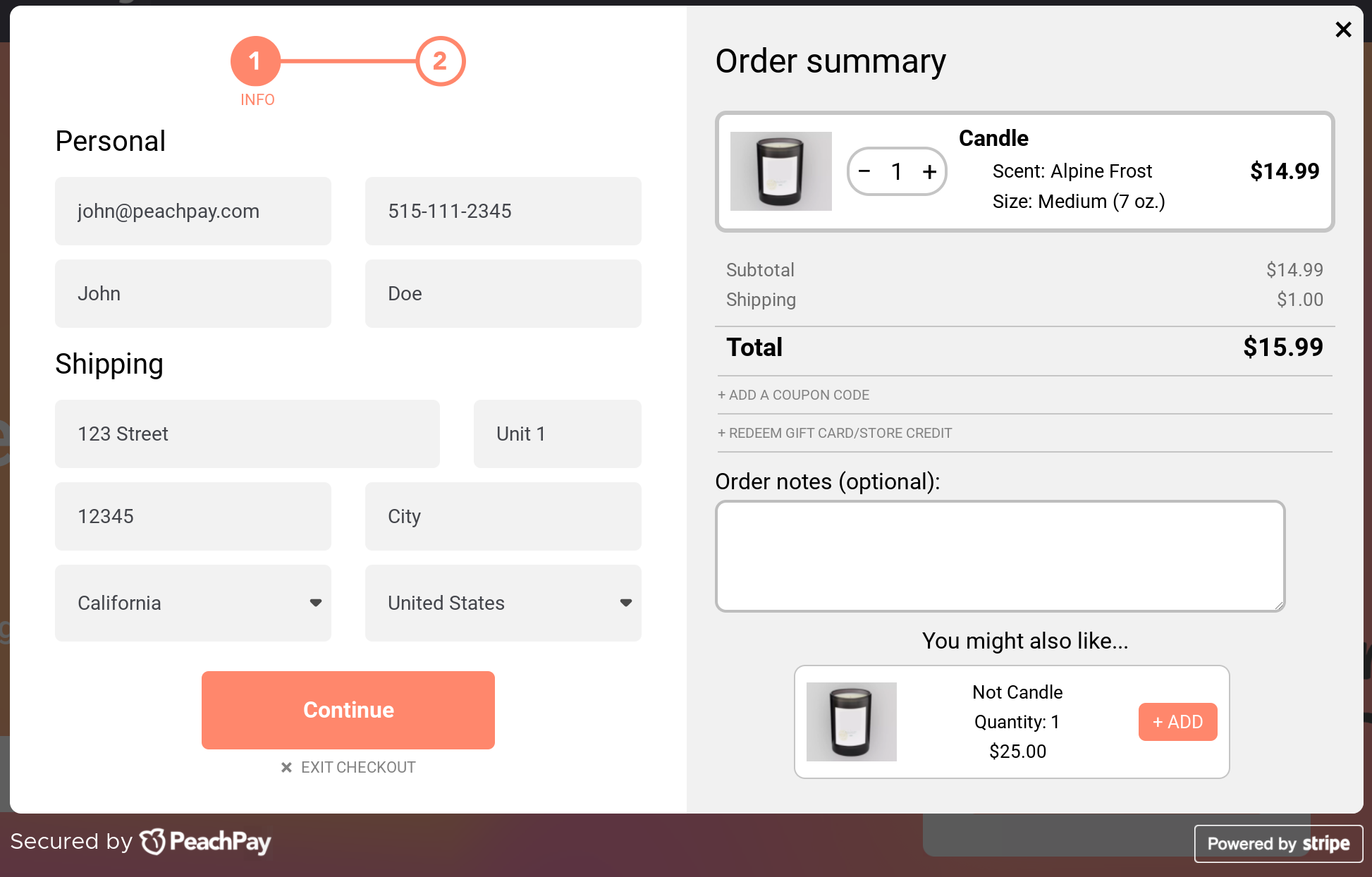
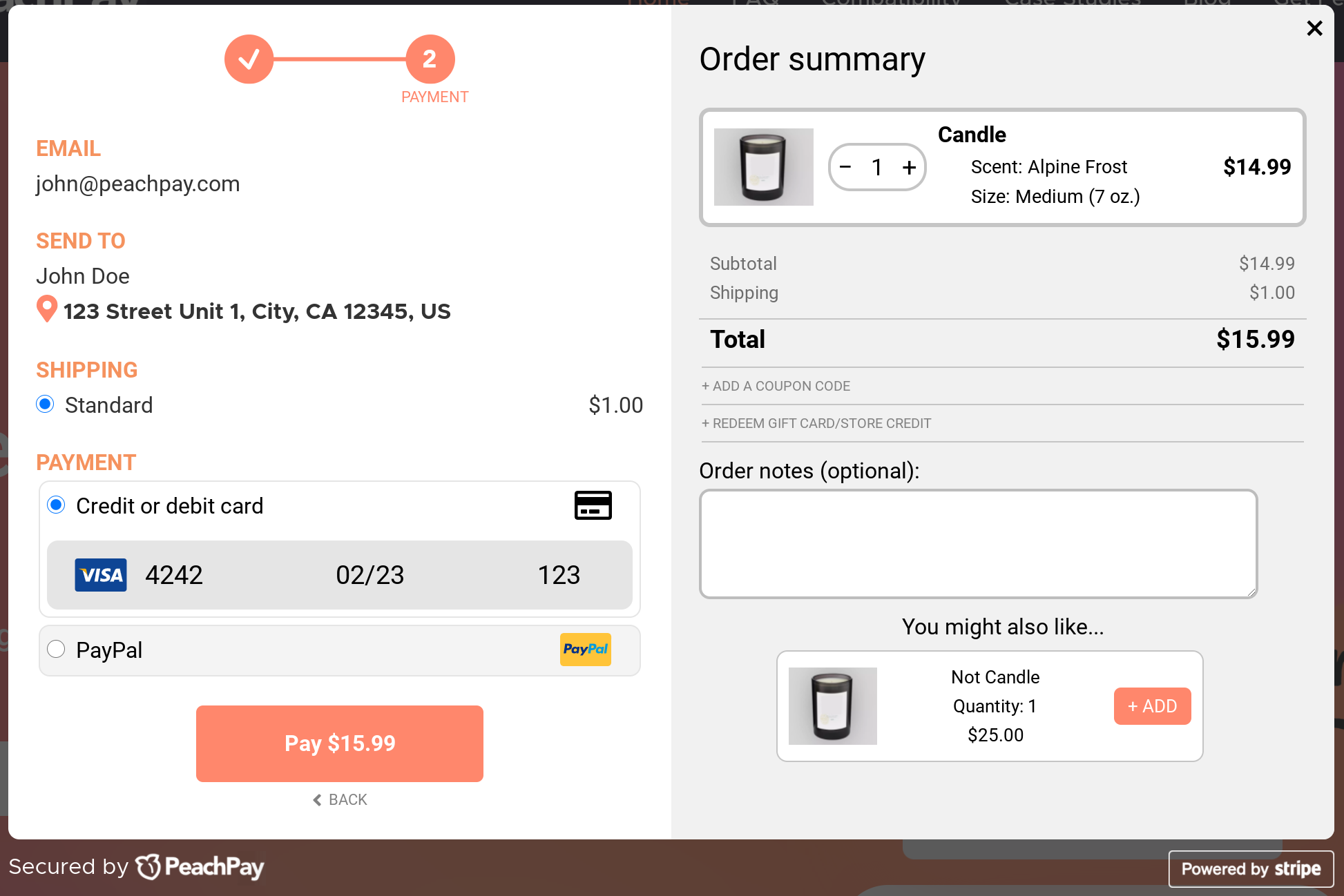
PeachPay adds an express checkout to your product pages (and thereby converts each product page into a checkout page).
Essentially, PeachPay adds an Express Checkout button to each of your product pages. Notice the Buy with one click button on the product page for this WooCommerce store:
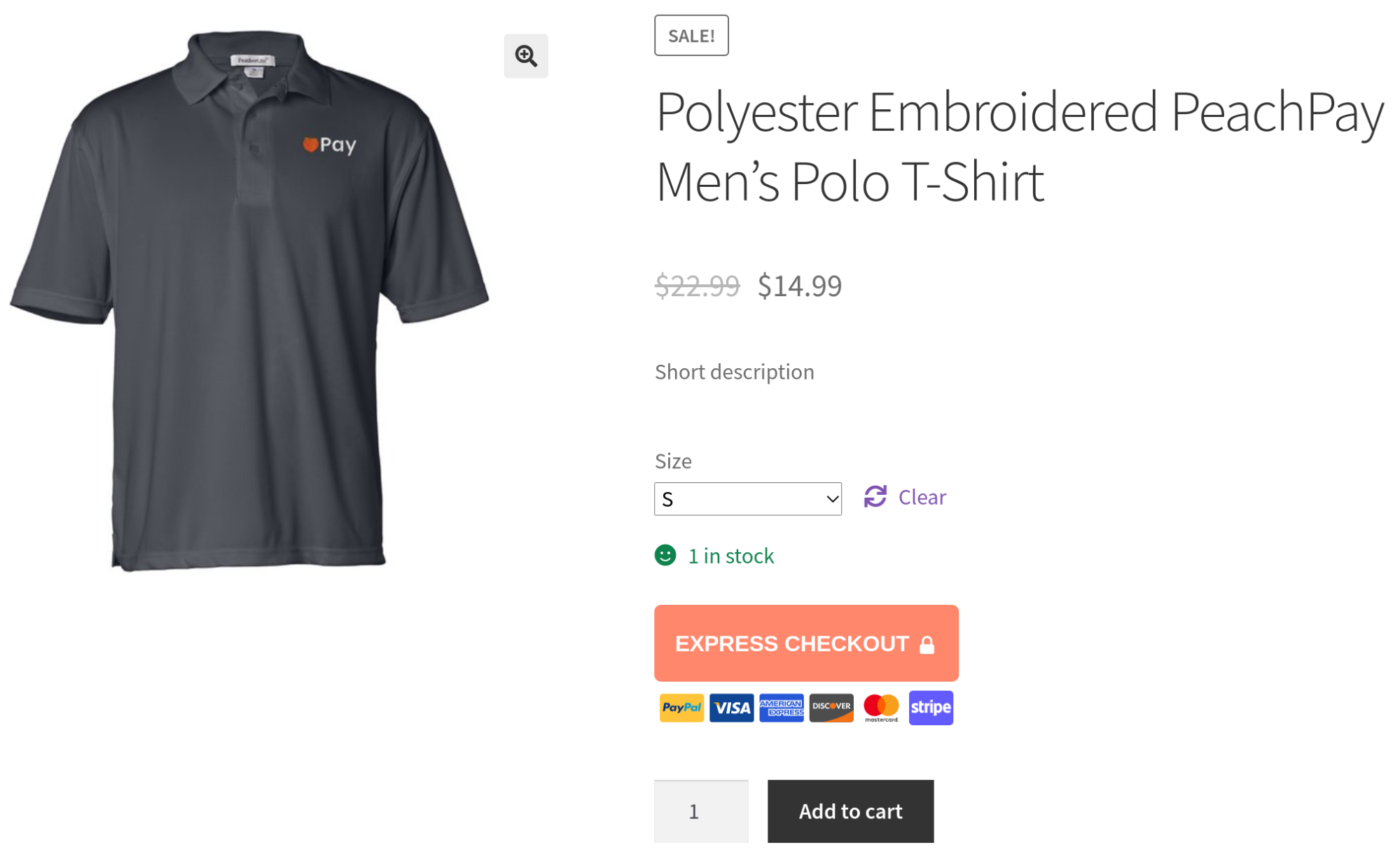
Each time a user clicks PeaachPay's express checkout button, they're redirected straight to your checkout page (a checkout window, in our case!).
If they're a first-time buyer, then they'll see PeachPay's window checkout.
And if they're a returning shopper, they'd get PeachPay's one-click checkout option. PeachPay eliminates the add-to-cart step in the default WooCommerce checkout process, thereby making the purchase faster and smoother. With the express checkout option enabled, each page is just a click away from the checkout. This checkout flow is handy for making quick purchases.
PeachPay brings Amazon-like "one-click checkout" for your returning visitors.
Wouldn't you hate it if Amazon made you fill in your name, address, and payment details each time you returned to place an order? You would. And that's why Amazon pioneered a one-click checkout. Essentially, Amazon remembers your details from your earlier purchase(s) and auto-fills your checkout using them. All you have to do is click the Buy button. And done.
PeachPay lets you add Amazon-like one-click checkout to your store so you can make shopping even more frictionless for your returning customers.
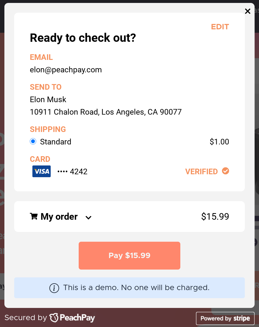
Each time a returning shopper visits your WooCommerce store and clicks PeachPay's express checkout button, PeachPay pulls up all their details and offers a one-click purchase. PeachPay transforms how your returning visitors shop on your store!
Using PeachPay to customize WooCommerce checkout page
As you just saw, PeachPay works on all the core areas of your checkout process to help you get more conversions and decrease your cart abandonment rate. Here's how you can overhaul your existing WooCommerce checkout page (and process) with PeachPay.
Using PeachPay to customize your WooCommerce checkout page (and process)
PeachPay is a free plugin that you can download from the WordPress.org repository. An even easier way to install PeachPay on your store is to head straight to the PeachPay website, navigate to the “Get PeachPay” page, and enter your store's URL:
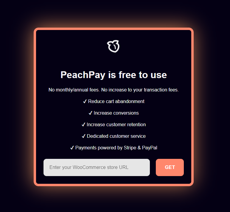
Clicking GET takes you to your WooCommerce store's login page. Just log in, and you should be able to activate your plugin:
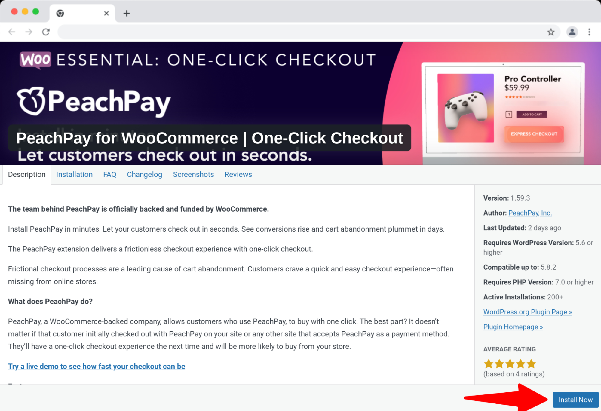
Once the plugin is live, you can access its settings. Here's a quick overview:
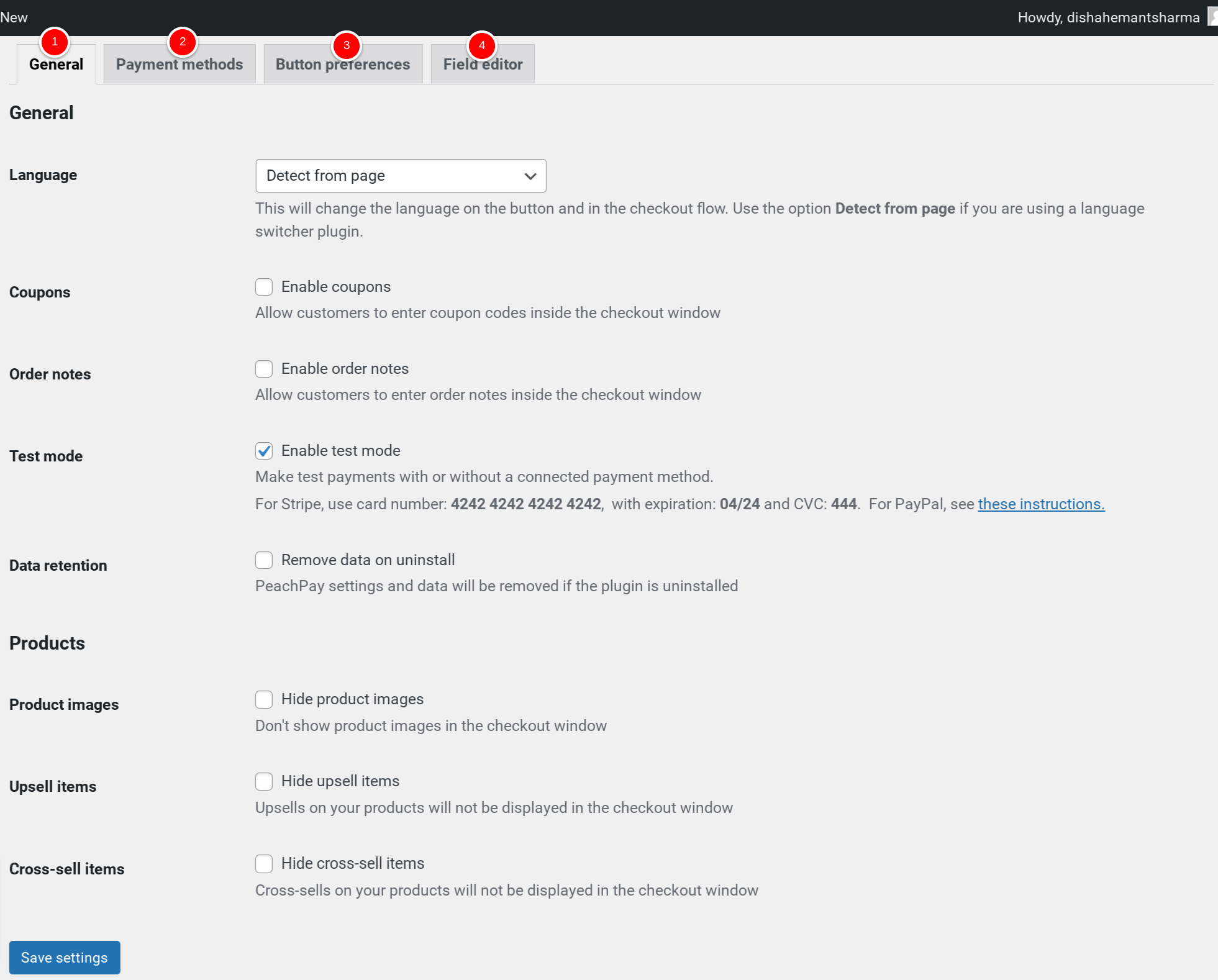
1. General settings tab:
You can enable cross-selling and upselling for your WooCommerce products using PeachPay's General tab. As you can see, you can also disable your checkout form's coupon and order notes input fields via it.
2. Button preferences tab:
You don't have to write any custom CSS to style your button. Using PeachPay's Button Preferences settings, you can easily style the express checkout button for your product, cart, and checkout pages. You can choose a custom color for it, edit its copy, or even add an animation. The default button already follows conversion best practices.
3. Payment Method tab:
Here, you can connect your PeachPay account with your PayPal and Stripe accounts. PeachPay offers native integration with both these payment gateways, so most WoCommerce stores can offer their users multiple payment options that these gateways support to pay via PeachPay. You can find the payment integration documentation here.
4. Form Fields Editor tab:
If you'd like to add additional fields to your checkout window, you can do so here. This is PeachPay's lightweight form builder/editor.
Complementing your existing checkout process with PeachPay
If you aren't ready to replace your default WooCommerce checkout page with PeachPay's modal checkout, it's all right. PeachPay integrates seamlessly into your existing WooCommerce setup as well, so you can add PeachPay's express checkout option to your existing checkout options on your product, cart, and checkout pages. Doing so alone instantly improves your user experiences as users can place orders quickly and get to the checkout with just one click.
Here's a product page using PeachPay's express checkout in addition to the store's default checkout options:
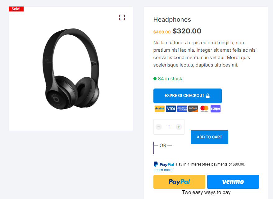
Below you have a WooCommerce store showing a slick express checkout (PeachPay) option on a typical WooCommerce cart page:
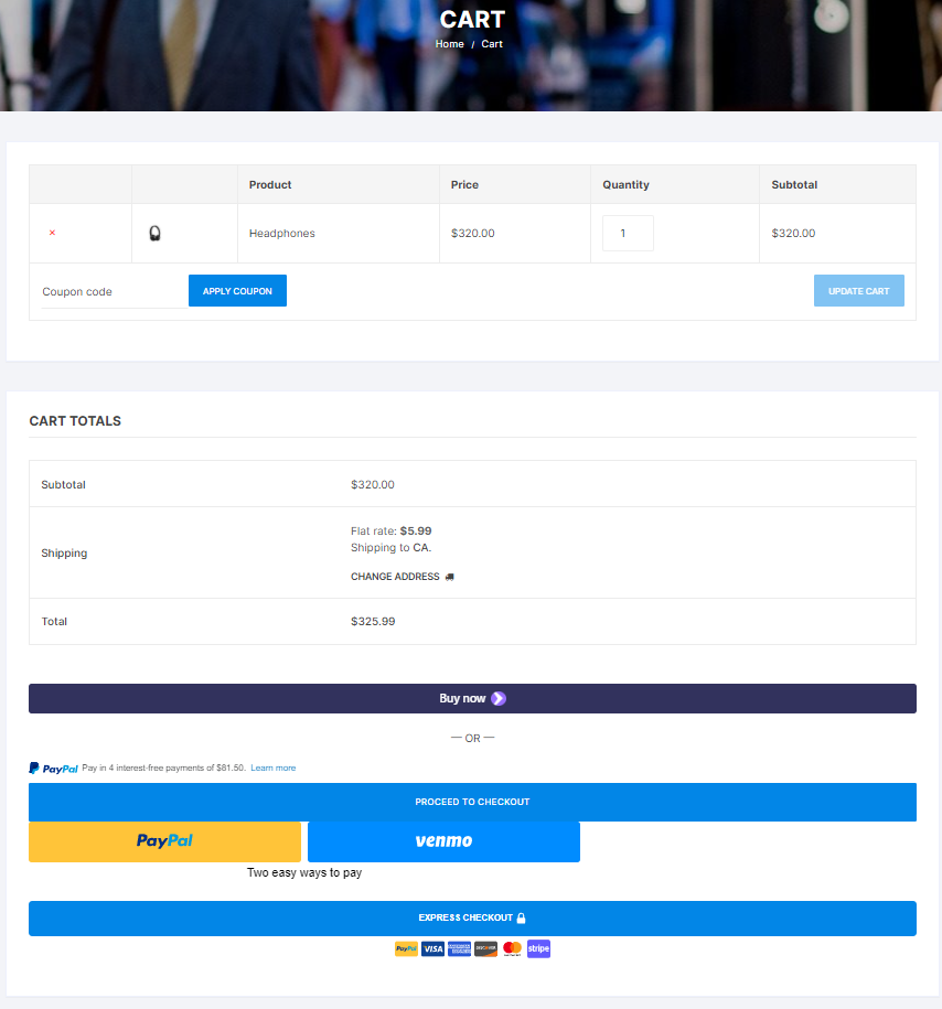
Even if your store uses a side cart page layout, you'll have no problem adding PeachPay's express checkout option on it as PeachPay supports a side cart as well.
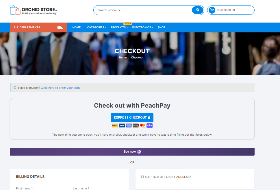
Likewise, if you use the PeachPay express option on your checkout page, PeachPay's express checkout button will show up on it in addition to your WooCommerce checkout page's other default checkout options. Below, you have a regular WooCommerce checkout page giving users a chance to check out with PeachPay: (As you can see, PeachPay tells users exactly why they should complete the checkout via PeachPay as they won't need to refill their details for their future purchases.)
Wrapping it up…
Abandoned shopping sessions are a persistent struggle for eCommerce stores. A lot of times, cart abandonment is actually checkout abandonment. Such abandonment instances that happen with both first-time and returning customers — hurt the most as these people are almost "there."
But the best part is that by optimizing your store's checkout process, you can recover a lot of your almost lost revenue. In fact, to fix these eCommerce conversion funnel leaks and improve their cart abandonment rate (and increase their average order value), many eCommerce stores:
-
Implement solutions like setting up a one-page checkout to ask their users for their shipping, billing, and payment details on the same page
-
Use WooCommerce form editor plugins to reduce the number of WooCommerce's required fields or get rid of the optional ones like order notes, coupons, among others, and even add custom checkout fields (if it makes sense)
-
Make the checkout more accessible from the product, store, and other pages by adding an express checkout or buy now button
-
Combine their cart and checkout page into one by redirecting their cart page traffic directly to their checkout page
-
Try multi-step checkouts to break up the process of checking out
-
Go all the way to set up an Amazon-like one-click checkout for returning customers
-
Implement upsells and cross-sells on the cart and checkout pages
Now, as WooCommerce doesn't do any of these by default, you need to get many WooCommerce plugins. You can either try getting over a dozen such extensions and work on integrating them OR get a WooCommerce checkout solution like PeachPay that does most of this! So download PeachPay now and transform the default WooCommerce checkout on your store with one that's optimized for conversions and works for both first-time and repeat customers.