WooCommerce Checkout Optimization - The Complete Guide
David Mainayar on | 8 min read
In its seminal study on cart abandonment, the Baymard Institute zoomed in on the elements of checkout that are most likely leading to cart abandonment. Researchers identified several factors.
First of all, a long and arduous checkout can prompt many people (17%) to leave. Another common reason is failing to find their favorite way to pay — limited payment methods. Technical errors, too, lead to cart/checkout abandonment.
The same study also suggests that optimizing the checkout can help recover a lot of abandoned carts — it translates to roughly a 35.26% increase in conversion rate for larger stores.
If you analyze the reasons for cart abandonment, you may notice that using WooCommerce's standard checkout, which ships with the core plugin, correlates to cart abandonment problems. While WooCommerce is the best eCommerce platform, its checkout could use some work, to put it lightly. This explains why Automattic (WooCommerce's parent company) has funded and partnered with PeachPay, a one-stop-shop checkout and payment solution, to ensure that WooCommerce customers have the best possible checkout experiences. In today's article, we'll walk you through the standard WooCommerce checkout process and show how you can optimize each step to get more sales with PeachPay, a free WooCommerce checkout plugin that you can set up within minutes and with absolutely no coding experience.
Optimizing WooCommerce's shopping cart and "add to cart" behavior
Shoppers begin their checkout flow on product pages, as the first step of the journey is adding products to their carts. To better understand how you can improve this process, let's see how WooCommerce approaches the shopping cart and the "add to cart" behavior.
Technically, the first point of the WooCommerce purchase process is the product page, as this is where the "Add to cart" button sits. By default, WooCommerce supports just one button on product pages:
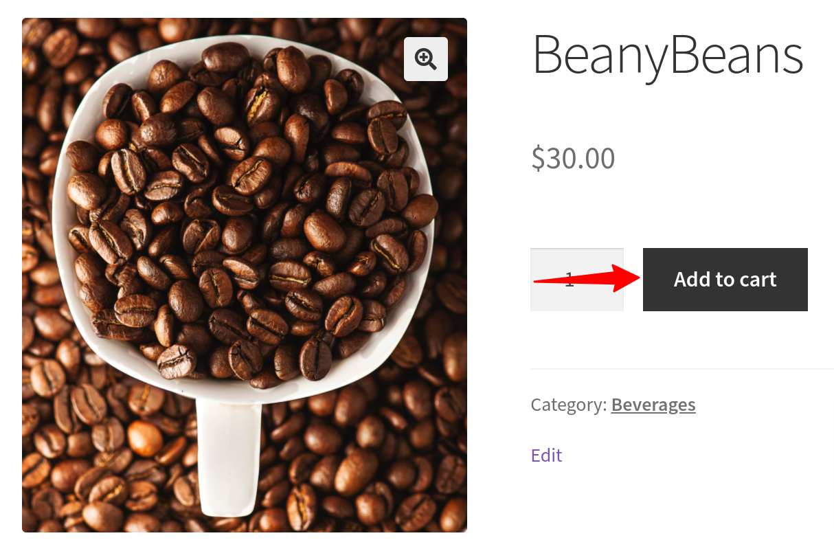
As such, this is fine.
However, if you look at Amazon's product pages, you'll see that they carry two buttons:
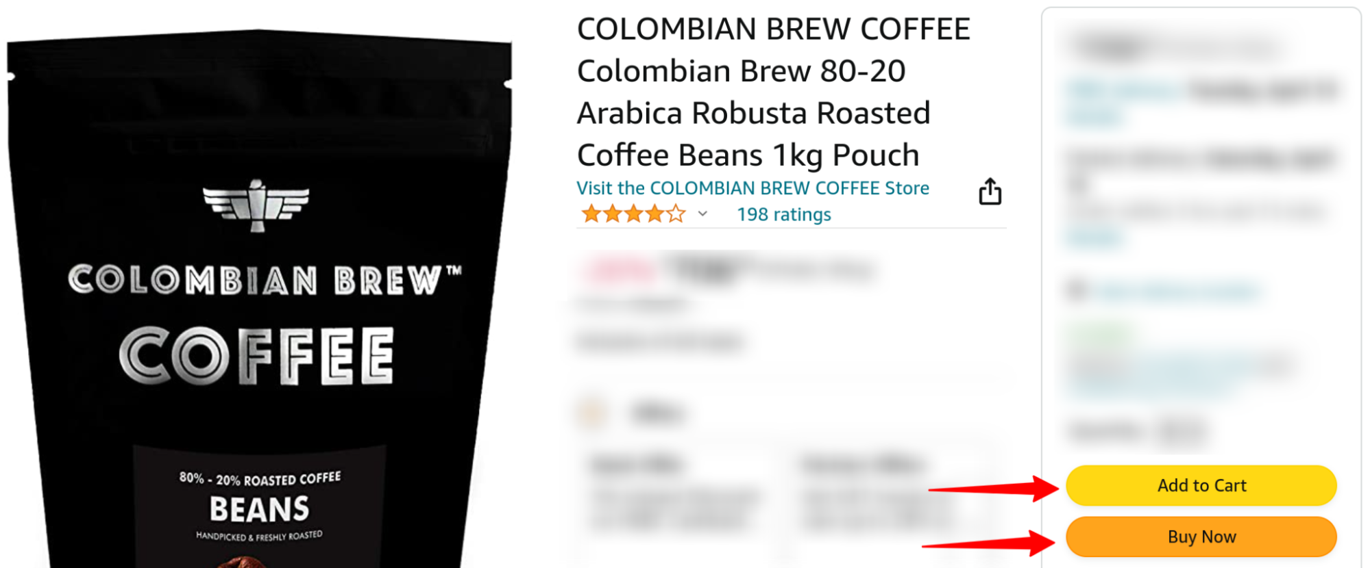
The first button you see is the standard "Add to Cart" button. The second is the "Buy Now" button.
When you click the "Add to Cart" button, Amazon adds the product to your cart and takes you to a sort of a recommendations page where you can add similar or related products to your cart. You can also 1) visit your cart page and 2) proceed to checkout.
In contrast, if you click the "Buy Now" button on the product page, Amazon takes you directly to its checkout page.
Did you see what's going on here? One click and you're already at the checkout. This "express" checkout is perfect for quick purchases. On the other hand, WooCommerce doesn't support such a one-click-to-checkout feature by default.
To optimize your WooCommerce checkout flow, you might want to start with your product pages. Since WooCommerce doesn't offer the express checkout option right out of the box, you'll need a plugin. PeachPay is a great option because it seamlessly adds "Buy Now" buttons to all your product pages in just a few clicks, and this feature works right out of the box.
Here's a live WooCommerce store showing an "Express Checkout'' button on its product pages with PeachPay:
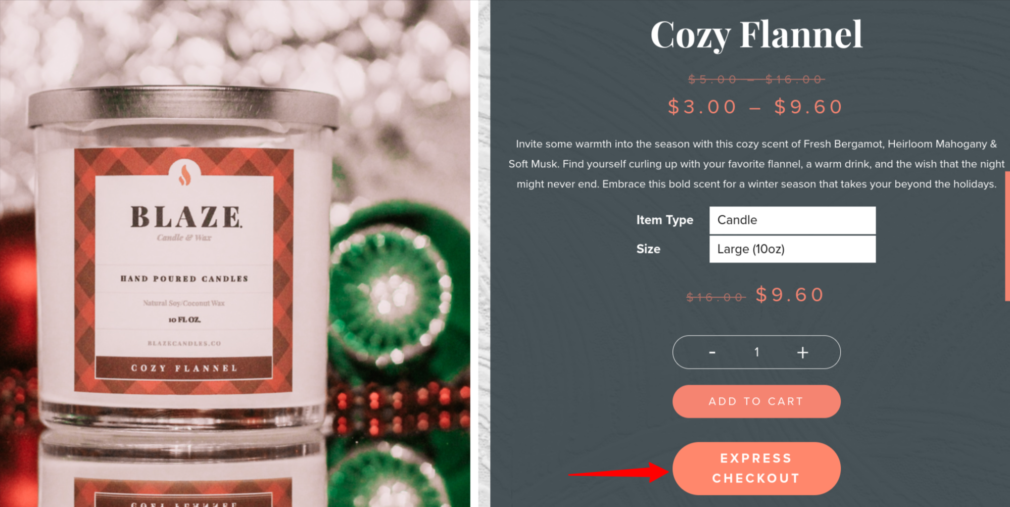
To add such an express checkout option to your store with PeachPay, all you need to do is style your button using PeachPay's easy button customizer: (The option is enabled by default — it can be turned off.)
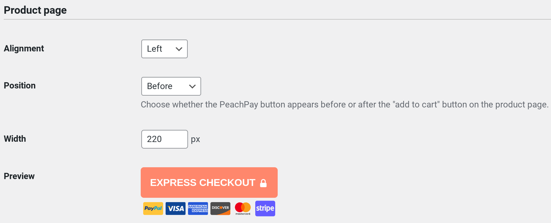
And done. When your shoppers click the express checkout option instead of adding items to their cart, PeachPay's slick checkout window pops up. (More on this below.)
Let's now proceed to step two of the standard WooCommerce checkout flow and see how it can be optimized.
When you click the "Add to Cart" button with default WooCommerce, it pretty much keeps you on the same product page, but you'll see a notification at the top with a "View cart" text link:
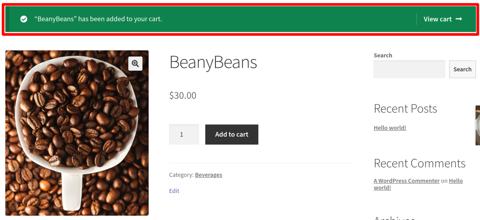
Most users need to click the "View cart" button to head to their cart page (from where they can finally get to the checkout).
There are three ways to optimize this step. Most store owners set up a direct checkout and entirely eliminate it. Here's how:
-
Use WooCommerce settings to redirect the traffic by clicking on the "View cart" link directly to the cart page.
-
Use shortcodes to eliminate the "View cart" step and redirect users adding items to the cart directly to the checkout page. This is more like a direct checkout as you're taking users to the checkout with a click from the product page.
-
Use a direct checkout like PeachPay to eliminate the unnecessary "View cart" step.
We have a step-by-step tutorial on implementing direct checkout covering all these methods here. Do check it out.
One more way to optimize your checkout process for this is to use a WooCommerce one-page checkout.
But what if you don't want to eliminate this step? In this case, the next best option for you is to recommend related products on your product page. Unlike Amazon, the standard WooCommerce checkout flow doesn't help you prominently promote recommended products and upsell/cross-sell at this step (at least not in its default settings). You can use PeachPay's related products functionality to do so. (More on this later.)
The next step on the default WooCommerce checkout flow is when users click the "View cart" link and get to the cart page.
Optimizing WooCommerce's cart page
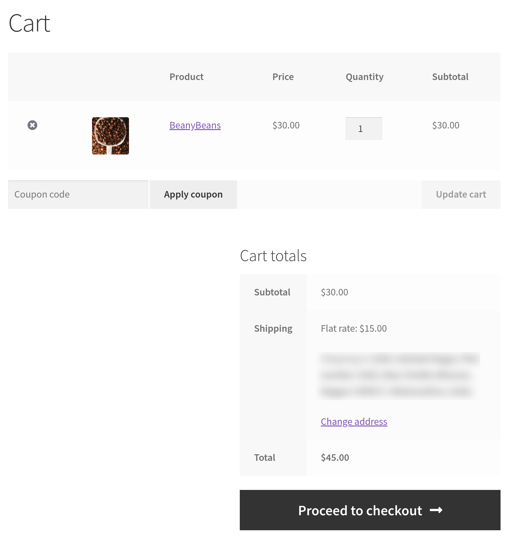
As you can see in the following screenshot, WooCommerce's default cart page offers shoppers a few important functionalities:
-
On the cart page, shoppers can edit their carts' contents.
-
They can also edit their items' quantities.
-
Finally, they can apply coupon codes.
Also notice that the cart page shows users how much shipping charges they're paying and additional charges, if any. Although this might seem unnoticeable, users are turned off by order totals they can't understand. 16% of shoppers actually quit the checkout when they can't see or understand the total order cost and its breakdown upfront. In other words, transparency and clear order costs and totals are a must.
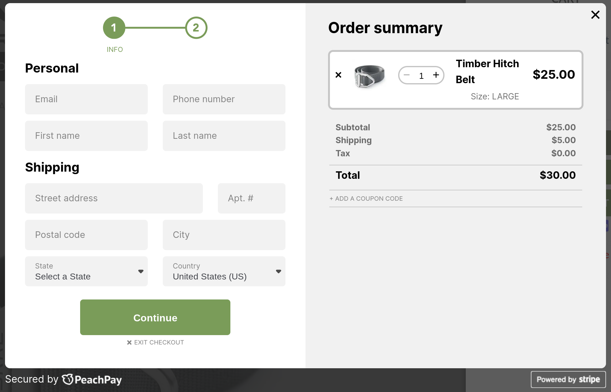
When stores implement direct checkout — which involves eliminating the view cart step and the cart page — they don't realize that cart page functionality (including the order total breakdown) goes along with the cart page! So when you skip the "View cart" step from your default WooCommerce checkout flow (from the previous section), be careful. Unless you use a plugin like PeachPay that brings all the cart page features to the checkout directly, you might have a hard time coding these functionalities into your checkout page.
In contrast, below you have a great example of a WooCommerce store that eliminated the cart page entirely from its default WooCommerce checkout flow. As you can see, it provides all the cart page functionalities right inside the checkout (via PeachPay):
But let's return to the default WooCommerce checkout flow. The next step is when consumers click the "Proceed to checkout" button and land on the checkout page.
The checkout stage
The WooCommerce checkout page itself is easily the most challenging part of checkout optimization (obviously).
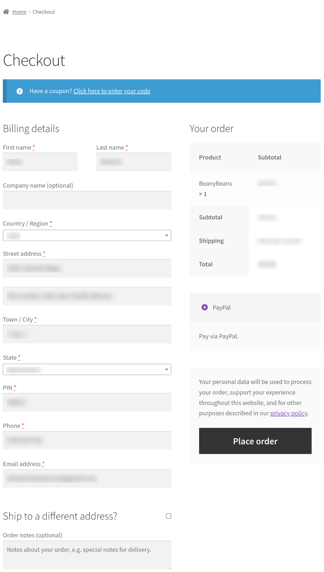
Let's go over a few of the biggest issues of the default WooCommerce checkout page:
-
First up, the standard layout the WooCommerce page uses feels like a LOT of work.
-
You're also looking at too many checkout form fields, some of which can be easily eliminated — the second field for the street address, the order notes field, and the coupons provision, for instance. WooCommerce doesn't offer any form field editing features, so you have to stick to the standard form. Deleting unnecessary fields or adding custom form field types isn't possible without using WooCommerce checkout field editor plugins like WooCommerce Checkout Manager.
-
You also have distracting elements like the data privacy notice. You already have this information on your store and don't need to have it here necessarily.
-
By default, WooCommerce also doesn't let you recommend products and boost your upsell/cross-sell revenue during the checkout.
About payment methods
While we're at it, let's also talk about WooCommerce payment methods. Not finding their preferred payment methods is one of the main reasons for users' cart abandonment. That's why payment methods are a key part of the checkout mix. WooCommerce offers several extensions to add payment methods like PayPal, credit and debit cards, and wallet payments. So as part of optimizing the WooCommerce checkout step, you don't just need to optimize the checkout page but also work on the backend to bring more payment methods to it.
In addition to offering your users their preferred payment methods, it's also essential to use design elements that inspire trust. About 18% of users who abandon their checkouts do so because they are not comfortable sharing their credit card credentials with the merchant. Trust seals are a great way to earn your users' trust, and your checkout button must use them. Using SSL and secure hosting, too, counts toward this.
Here's how to go about optimizing the default WooCommerce checkout page:
- Collect billing, shipping, and payment information in a more user-friendly and seamless way. One great way to do this is to replace the default WooCommerce page with a checkout window with a plugin like PeachPay. PeachPay takes WooCommerce's default multi-step, multi-page, and multi-click checkout and condenses it all into a slick conversion-optimized checkout window. Here's a live WooCommerce store that has replaced the default WooCommerce checkout page with PeachPay's checkout window:
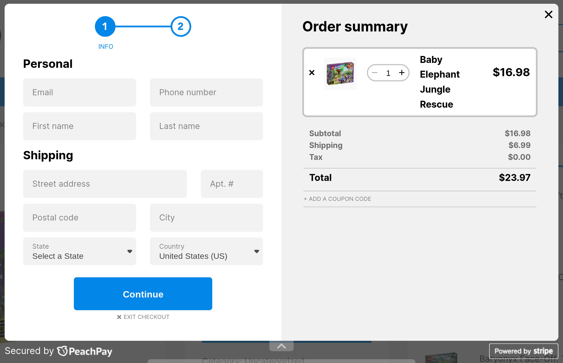
PeachPay first collects billing and shipping information while retaining the cart page functionalities. It then asks users for their payment credentials.
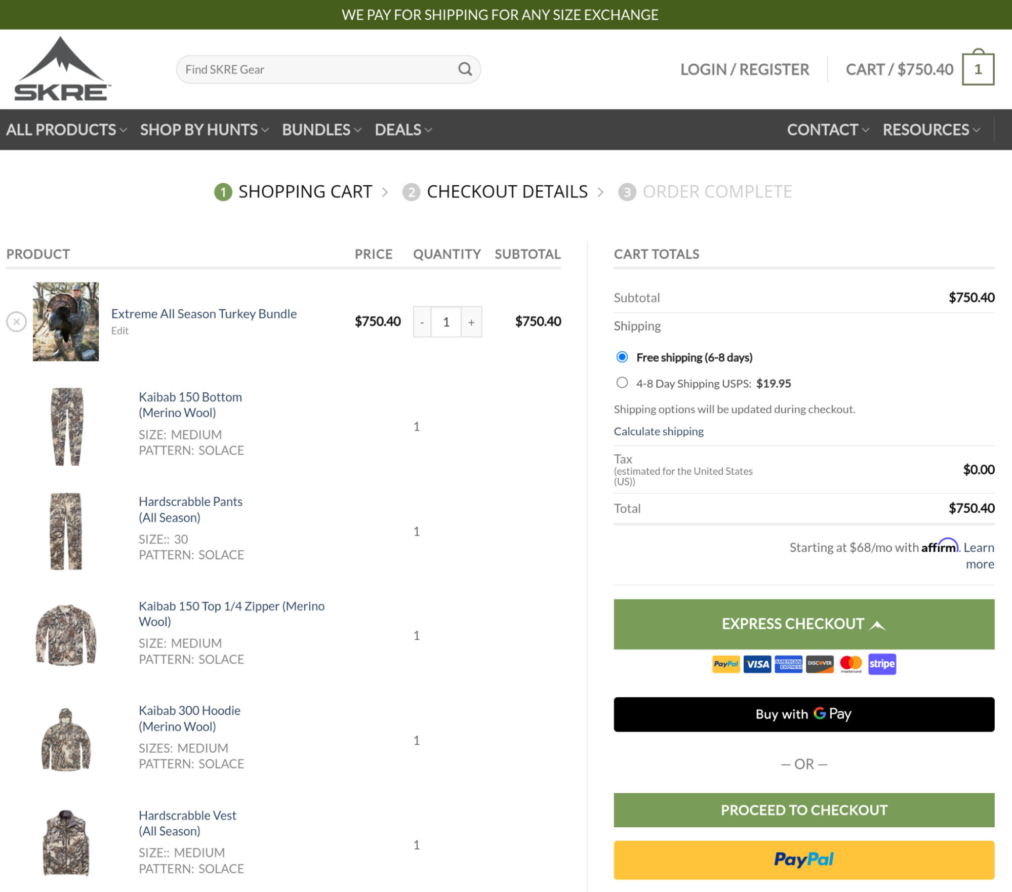
- Bring multiple payment methods to your checkout. Offering multiple payment methods usually means adding several payment gateway plugins to your store. However, you do have options like PeachPay that bring all the major payment gateways to your WooCommerce store. We already support PayPal and Stripe and are going to bring Square to the mix soon. Here's a WooCommerce site offering its users multiple payment methods via PeachPay so they can pay with their favorites:
- Recommend products to users during checkout. This method is known to boost order value. Naturally, to recommend products during your checkout, you need to use a "related products" plugin. With PeachPay, you get this right out of the box as it comes with a built-in functionality to show similar products. All you need to do is enable one setting, and PeachPay will show related products inside your checkout window. Here's a WooCommerce store recommending products to its users right inside PeachPay's checkout window:
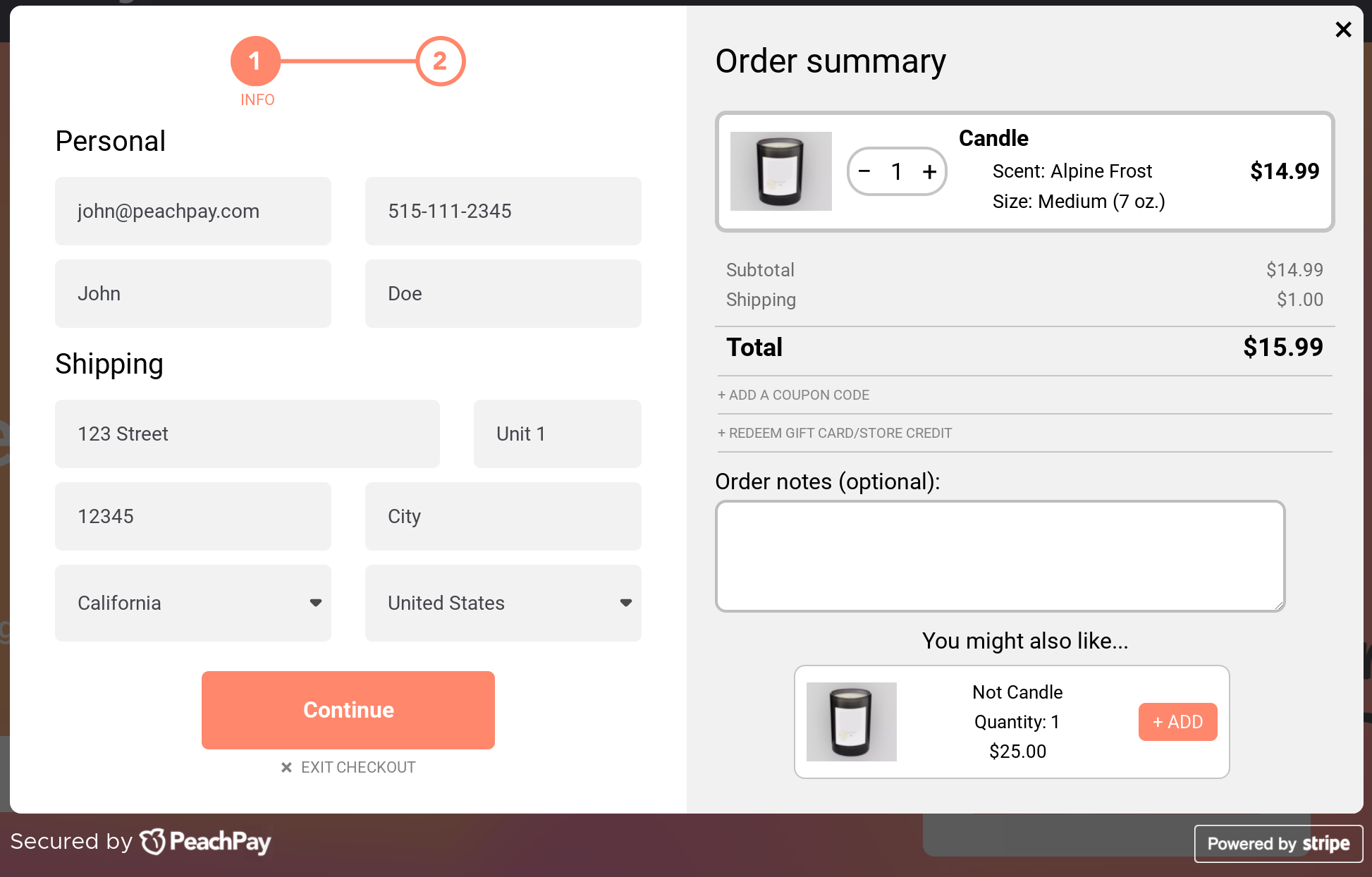
PeachPay uses product categories, tags, and attributes to identify related products. You can easily change the "Related products" label to whatever you like. Also, you get to choose the number of related products to display:
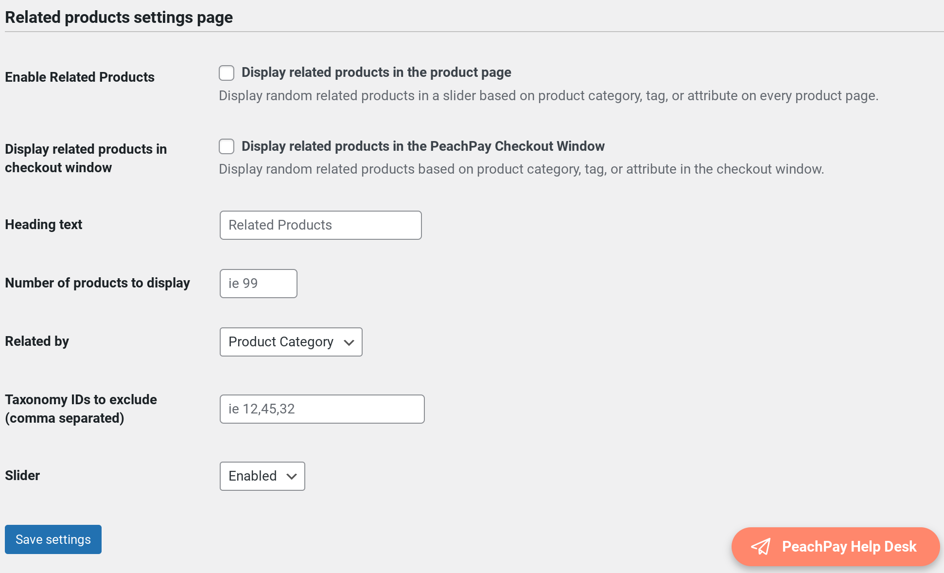
You can also enable PeachPay's related products functionality on your product pages.
Optimizing the WooCommerce checkout flow for returning users
Until now, all the optimization best practices that we saw apply to new shoppers — those who haven't previously purchased from your store.
Now let's talk about returning shoppers.
When a user buys from you, you store information such as:
-
Billing address
-
Shipping address
-
Payment details
This means that you shouldn't ask them for these details again when they make repeat purchases. Here, too, a plugin like PeachPay comes in handy. PeachPay brings slick Amazon-like one-click checkouts to your returning shoppers. All that returning users need to do in their checkout with PeachPay is to authenticate their purchase — and done. PeachPay automatically fetches all their details from their previous purchase. Here's PeachPay's one-click checkout for returning users in action:
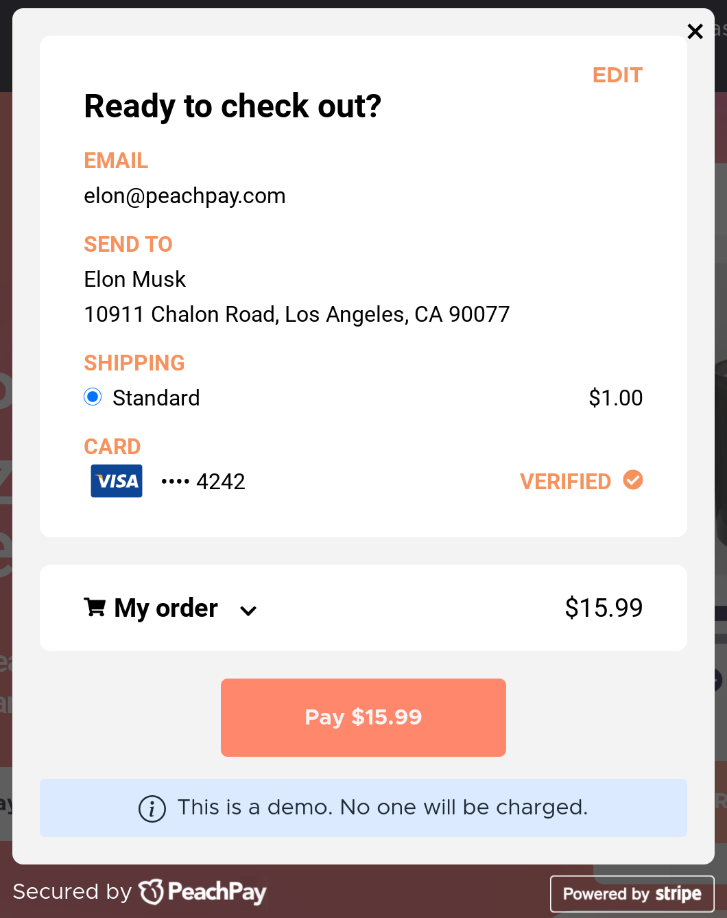
Notice how users can check out with exactly one click.
Wrapping it up…
As you just saw, optimizing the default WooCommerce checkout flow needs you to work on pretty much everything. Also, traditionally, optimizing each step requires a separate plugin:
-
Adding a buy now button means adding a direct checkout plugin.
-
Skipping the "View cart" step needs a plugin.
-
Editing the WooCommerce checkout page/form takes a plugin.
-
Adding payment methods like PayPal and Stripe means adding a couple of payment gateway plugins.
-
Bringing the one-click checkout to returning users needs yet another plugin.
Those are a lot of plugins and add-ons!
A much simpler way to optimize and streamline your entire WooCommerce checkout flow is PeachPay. It's an all-in-one WooCommerce checkout solution backed by Automattic (the company behind WordPress) that not only simplifies your checkout and speeds it up but also helps boost your average order value. Moreover, by doubling up as a payment gateway integration plugin, PeachPay also lets you offer your users their preferred payment options.
PeachPay also comes with many more cool features like the ability to add express checkout buttons to landing pages and a floating cart icon, among others.
So get the free PeachPay plugin now and offer your customers the seamless checkout experiences they deserve.