Beautiful Examples of WooCommerce Checkout Pages
David Mainayar on | 8 min read
By optimizing your checkout process, you can recover most of this lost revenue.
This is especially true if you use WooCommerce's default checkout because, while it does provide you with all the information you need to successfully carry out an order, it isn't so conversion-friendly. In fact, to improve upon it and give WooCommerce stores the best possible and most conversion-optimized checkouts, Automattic (WooCommerce's parent company) invests in checkout solutions like PeachPay (yours truly!). We help WooCommerce stores like yours to get more conversions by replacing WooCommerce's standard checkout with a sleek and easy-to-use checkout window.
In today's article, we'll look at a few WooCommerce checkout examples that got excellent results from adding PeachPay to their WooCommerce checkout mix. We'll also see how you can offer a similar checkout on your store with PeachPay. PeachPay is a free plugin that takes just minutes to set up.
Here goes.
The best WooCommerce checkout examples optimized for conversions
-
Blaze Candle & Wax
-
MinifigWorks
-
SKRE
-
You Go Pro Baseball
Blaze Candle & Wax
Blaze Candle & Wax is a small business that sells handcrafted scented candles. Based out of Aurora, Illinois, Blaze Candle & Wax prides itself in offering premium candles at affordable pricing. Using just eco-friendly wicks and natural waxes, this company wants to provide shoppers with their best fragrance experiences.
Like any other online store, Blaze Candle & Wax also needs to deliver a checkout experience in line with its shoppers' needs.
For example, if a Blaze Candle & Wax customer takes a liking to a specific product, they would prefer to check out quickly straight from the product page. This is something WooCommerce doesn't support by default.
Also, such a consumer would want to keep returning to the store (often frequently) to restock. This applies to pretty much all replenishable items, actually. Since this item is an excellent gift article as well, there's a good chance a customer might want to return to the store for making gift purchases too.
Such repeat shoppers deserve a different kind of checkout experience. Why? Because you already have all the information you need to do their checkout. You have their:
Contact information Shipping information And even their payment information
There's no need for the store to keep asking shoppers for this information each time they return for a repeat purchase. All a store needs in such cases is for the shopper to authenticate the purchase — that's it. This is called a one-click checkout for returning shoppers. You might have seen this on Amazon, too (with its buy now button). As you know, WooCommerce doesn't offer this feature either.
Blaze Candle & Wax found the solution to all their checkout needs in PeachPay. In fact, ever since Blaze Candle & Wax added PeachPay to their WooCommerce checkout mix, they "saw an incredible increase in transactions routed through PeachPay." The number of orders more than quadrupled in the month following PeachPay's installation.
Let's now see how Blaze Candle & Wax has built a PeachPay-powered checkout:
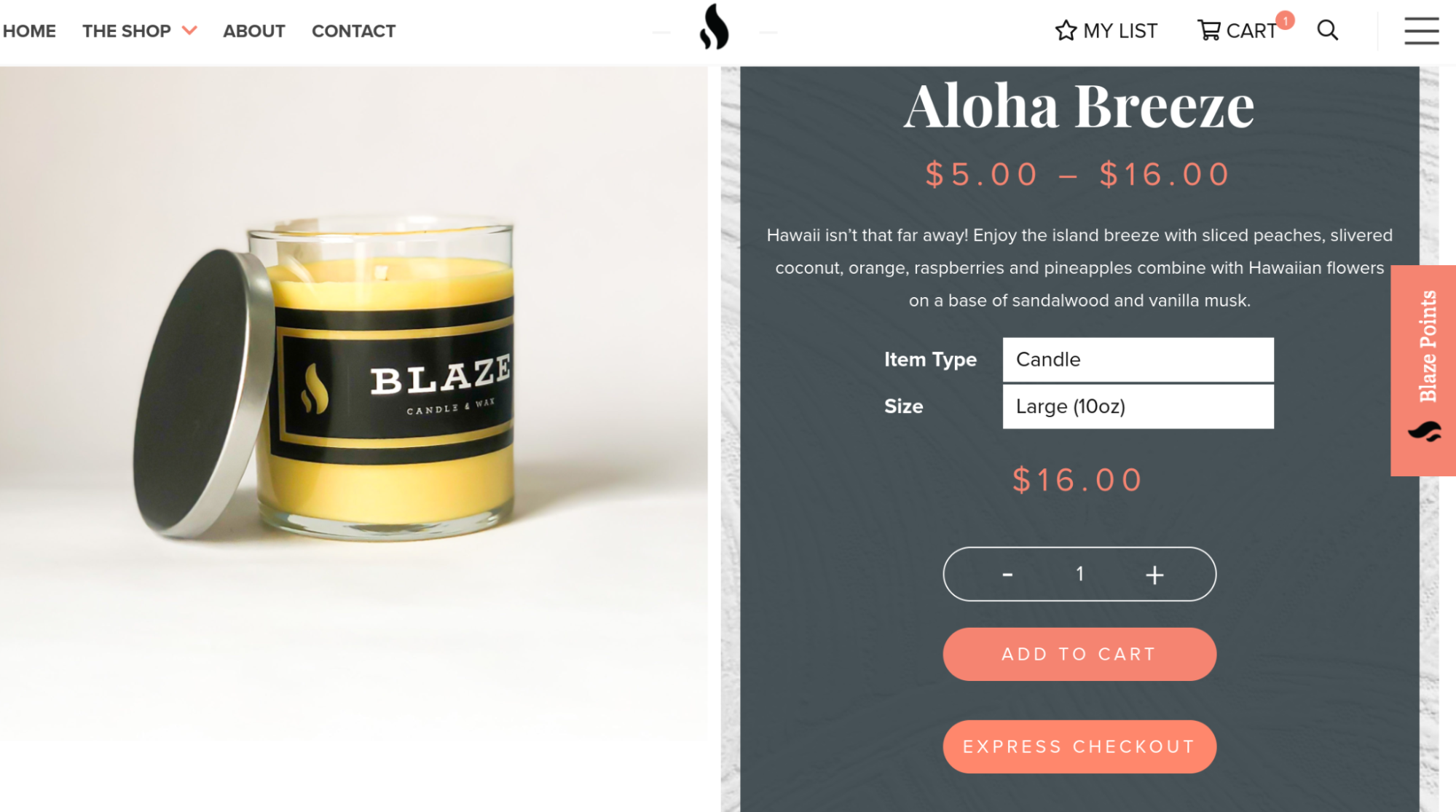
- As you can see, right on the product page, Blaze candle & Wax offers PeachPay's Express checkout option in addition to the default Add to cart button. Shoppers can jump straight to the checkout with one click using express checkout:
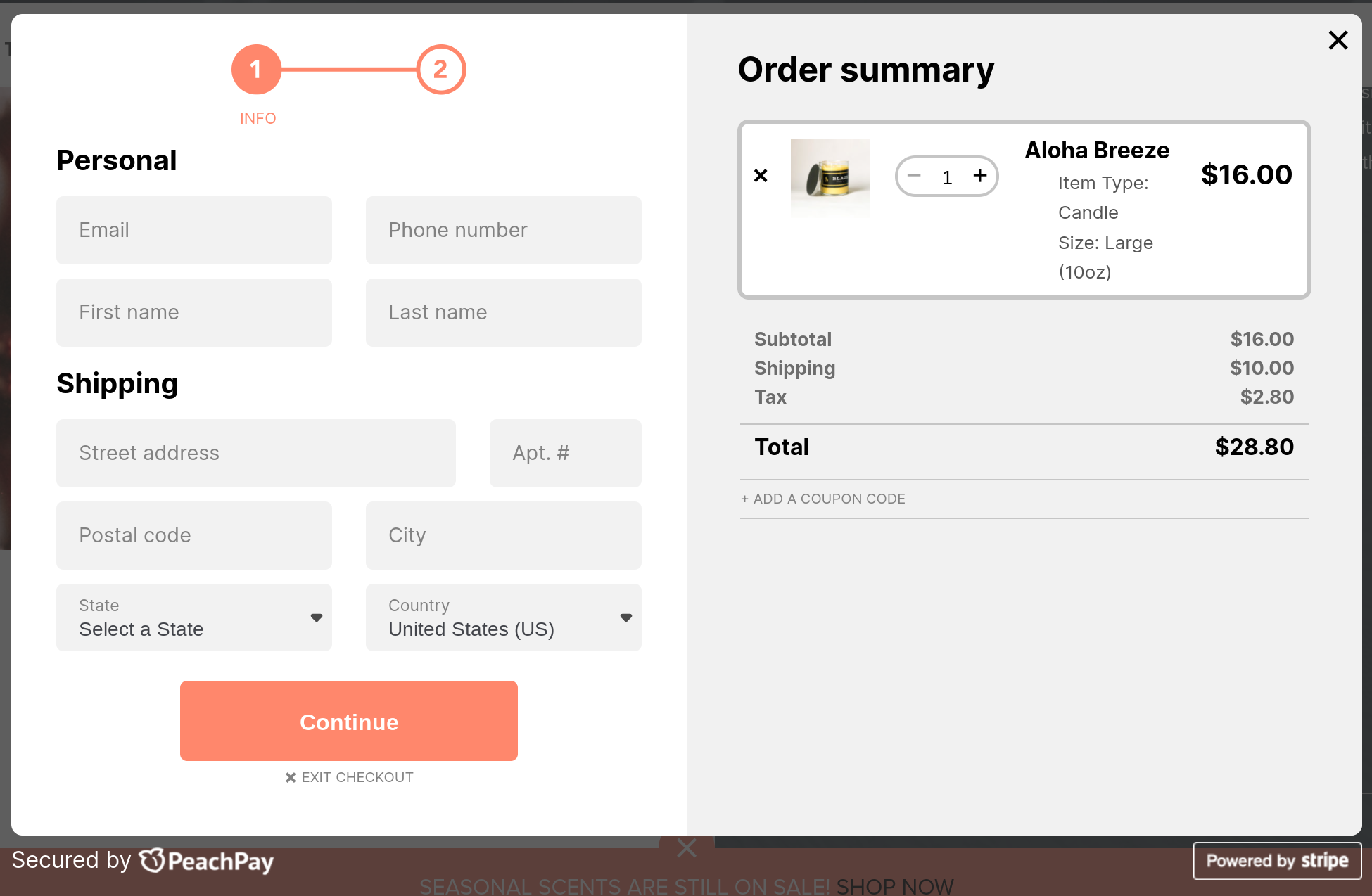
- For new shoppers, clicking the Express checkout opens up PeachPay's very easy-to-complete window checkout (compare it with WooCommerce's default checkout page, and you'll feel the difference!):
- Returning shoppers don't have to go through the entire checkout process. Clicking the express checkout button opens up a one-click checkout where shoppers only need to click the buy button. That's it.
SKRE
SKRE is a multi-million dollar eCommerce store that sells high-quality hunting gear and apparel. As you can tell, it caters to a very niche audience that keeps returning to the store to get more stuff. Given the nature of the products, order values can run high at SKRE.
To offer its new shoppers a seamless shopper experience, SKRE supplemented WooCommerce's multi-page, multi-step default checkout with a side cart plugin and PeachPay. With PeachPay, SKRE's order volume more than doubled while recording all-time low cart abandonment rates.
Within three months of installing PeachPay, SKRE realized that one of every four orders the store processed happened via PeachPay. One more month into the installation and one of every three checkouts on the store happened via PeachPay.
As of now, hundreds of SRKE's returning customers default to PeachPay's one-click checkout, delighted by the ability to check out in seconds. SKRE's conversion rate has more than doubled, and it's also seen a durable increase in its average order value.
If this data tells you something, it's this: Returning shoppers love fast and convenient checkout experiences. SKRE's Josh Jensen notes how PeachPay has helped the business offer its "customers a fast and easy way to checkout, without the hassle of filling out a lot of information. It certainly has increased customer conversions and sales."
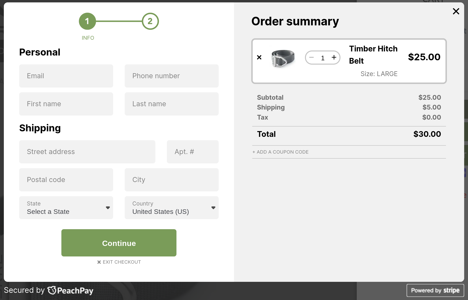
Let's walk through SKRE's checkout in detail and decode what's leading to these results.
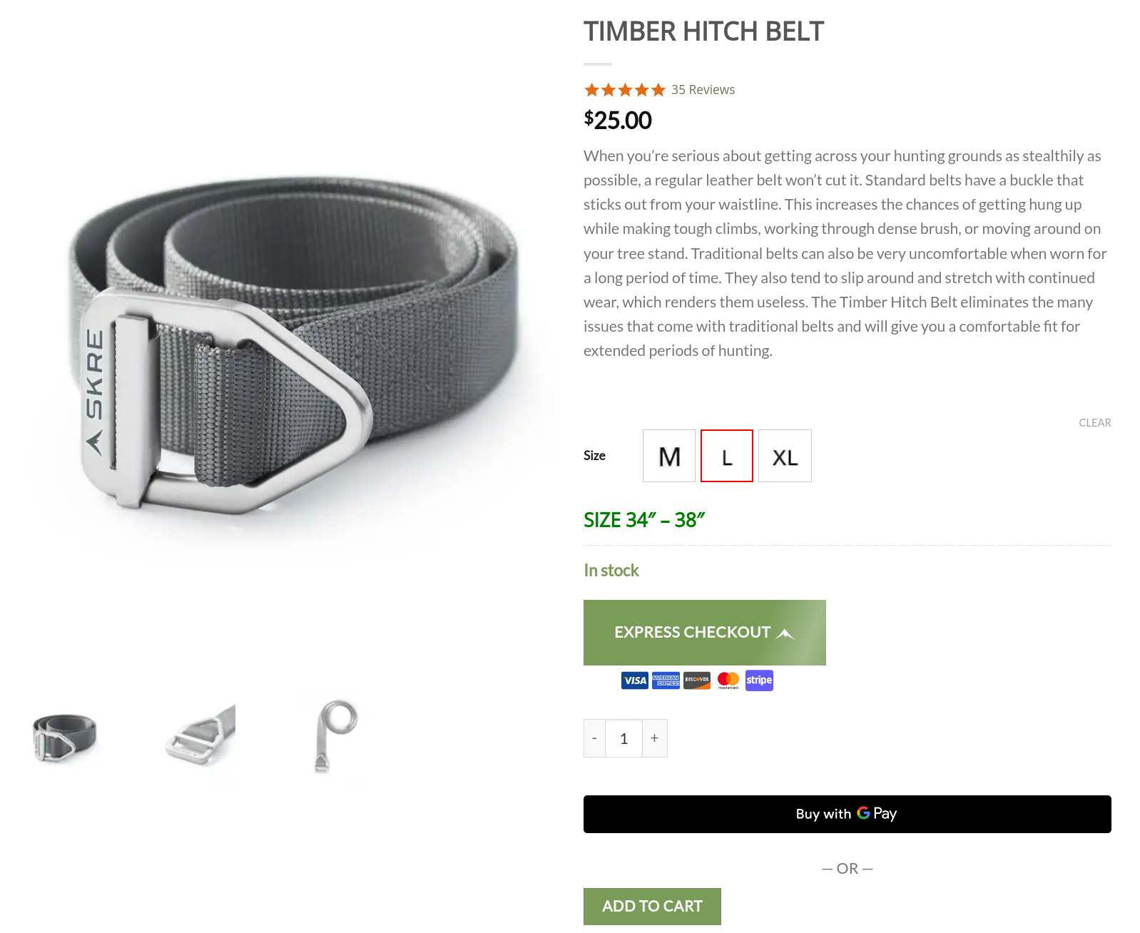
- On the product page, you can see PeachPay's Express checkout option. SKRE chose to display PeachPay's optional payment methods right below its express checkout button so shoppers can see how they can pay upfront. PeachPay's animation effects also help draw attention to the option. To prompt its shoppers to go with PeachPay, SKRE pushes its default Add to cart button below the express checkout option:
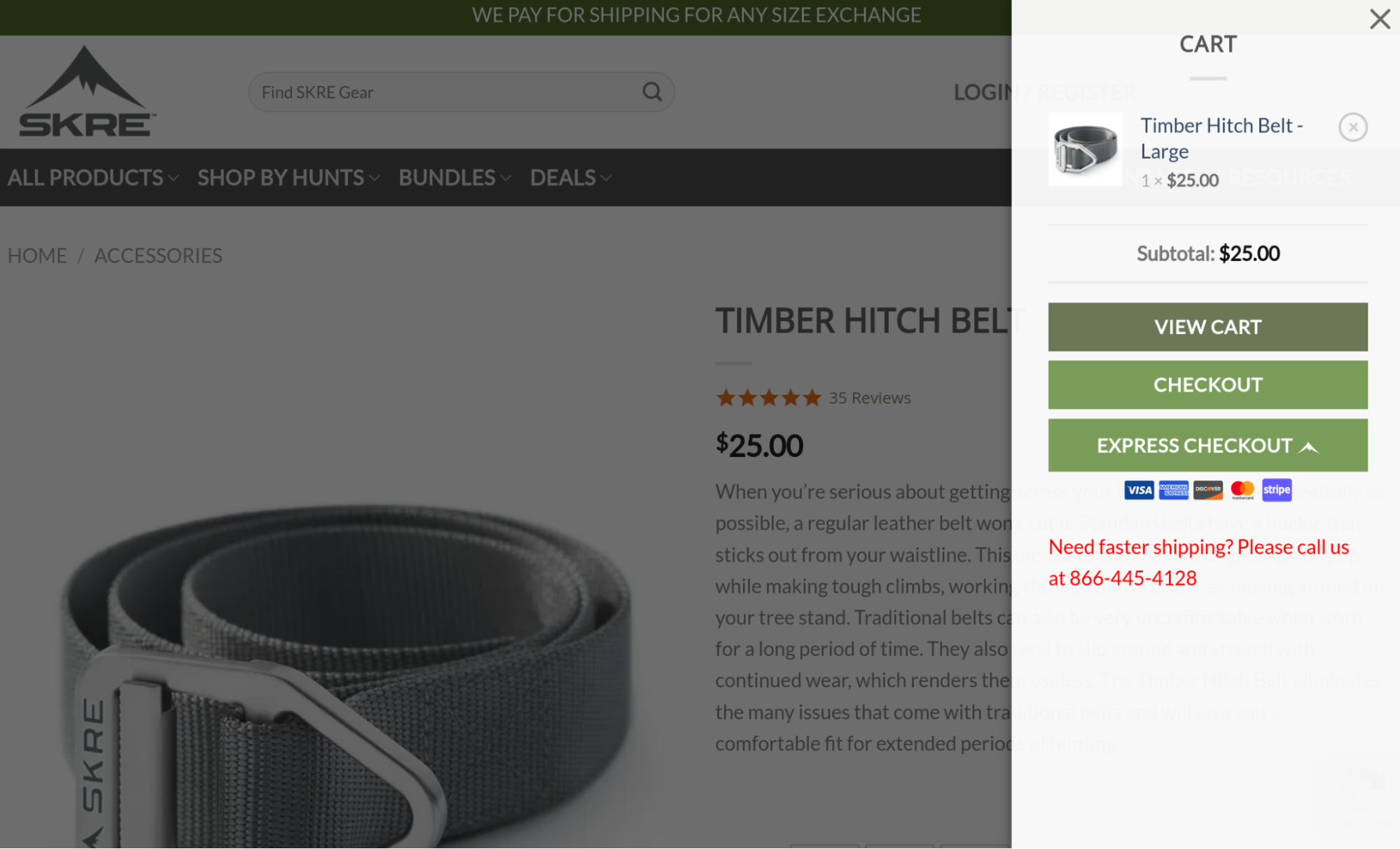
- If shoppers go with the add to cart option, a side cart pulls up. This side cart, again, shows PeachPay's express checkout option.
And if they click the plain checkout option, SKRE's checkout page shows up:
MinifigWorks
MinifigWorks — a LEGO product arbitrage company — works across both B2B and D2C lines and offers LEGO lovers the best deals on LEGO products. Just like any eCommerce store, MinifigWorks was seeing cart abandonment instances. It struggled to get its shoppers to complete WooCommerce's standard multi-step/multi-page checkout. shoppers could complete their checkouts on sites like Amazon and Bricklink in a fraction of the time they'd spend on the MinifigWorks website.
To resolve this, MinifigWorks added PeachPay to its checkout mix. Implementation-wise, MinifigWorks is quite similar to SKRE's checkout setup. MinifigWorks retains the standard WooCommerce checkout just as SKRE does.
- First, you have the Express checkout option on the product page. Just like SKRE, MinifigWorks positions its Express checkout option prominently above its standard checkout
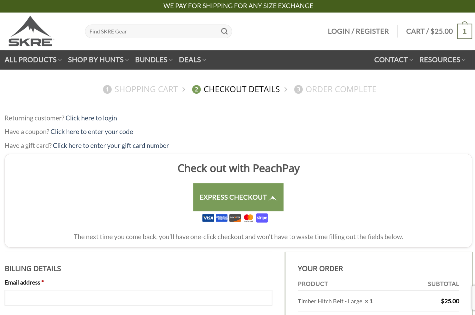
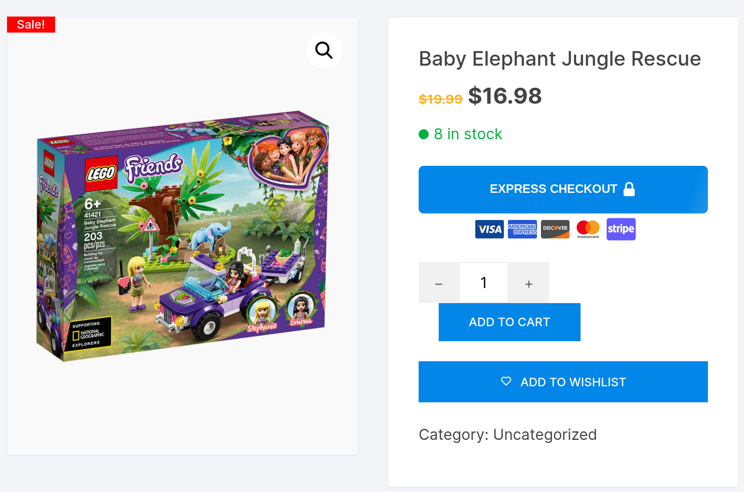
- Clicking the Express checkout window opens up a compact checkout window. For new shoppers, it looks like this:
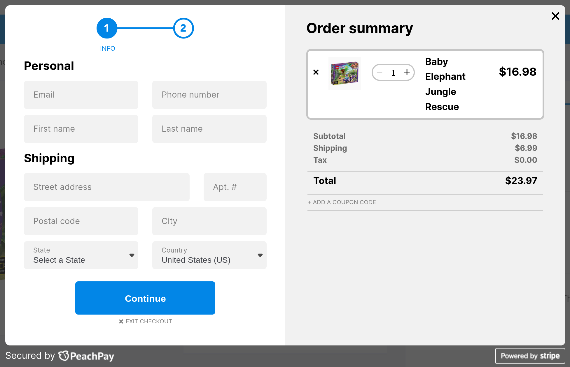
(Even if shoppers click the header cart icon, they're presented with a quick, direct checkout option with PeachPay.)
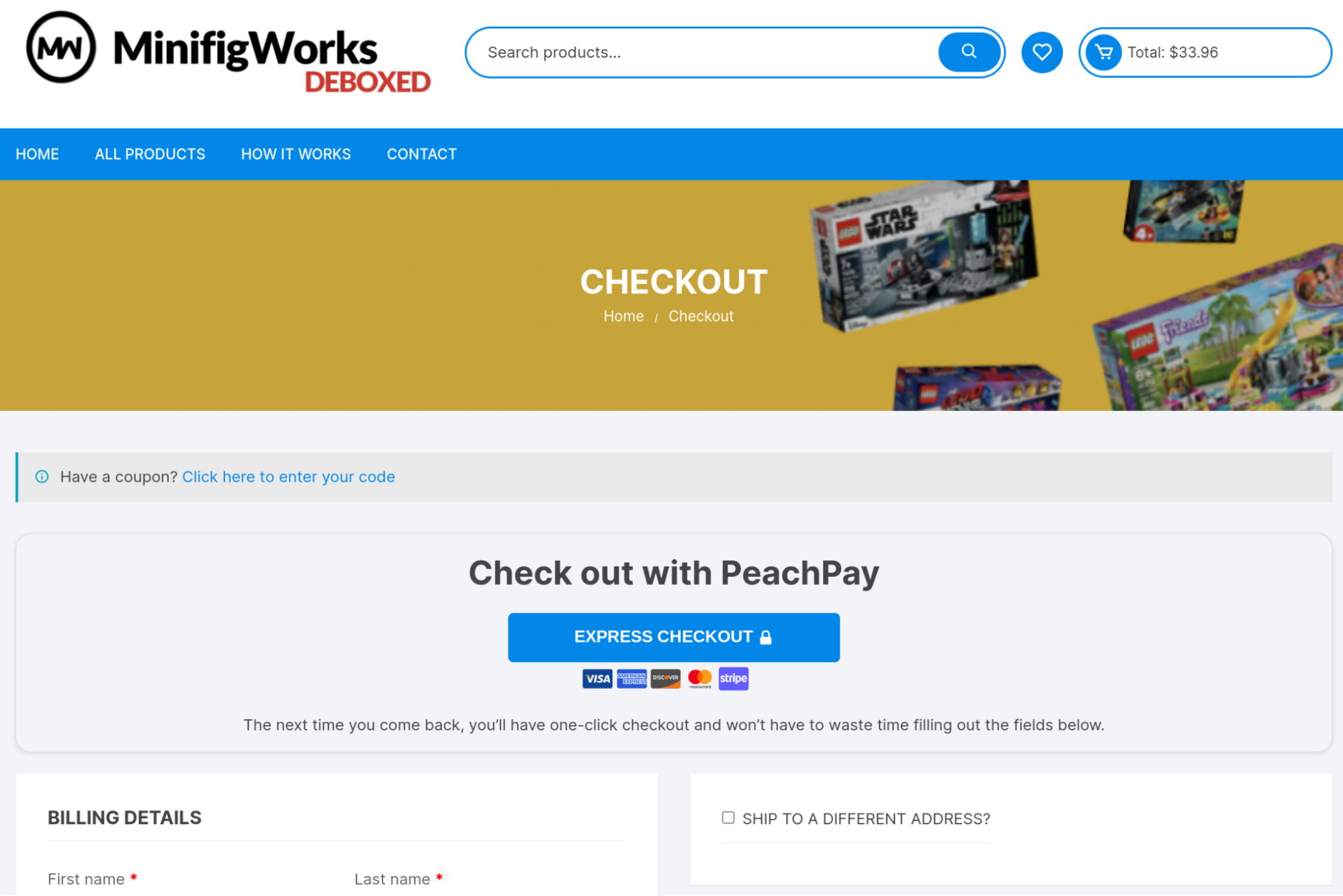
- If shoppers navigate to the checkout page, they have one last chance to try out PeachPay:
Within a month of using PeachPay, MinifigWorks saw a 72% increase in its conversion rate. The founder stated the following: "I've sold on Shopify, Amazon, a product-specific content management system, and most recently, on wooCommerce. Now that I'm using PeachPay for WooCommerce, I'm here to stay."
You Go Pro Baseball
A great checkout isn't just one that uses a conversion-friendly UI and makes a checkout feel like less work than it is. It's also essential to make it error-free.
Because while shoppers abandon checkouts that are long and tiring, they also do so when they run into errors.
By itself, WooCommerce works great. But think about the many different plugins you need to use for a WooCommerce store — especially for designing your checkout experience:
-
First up, you're looking at a bunch of plugins to bring the different payment gateways like PayPal and Stripe to it. If you want to add payment methods like Google Pay, you're looking at even more plugins.
-
If you want to show product recommendations during checkout, you need yet another plugin — this is important as last-minute upselling during the checkout process increases your average order value.
-
You need a checkout field editor plugin to reduce the number of checkout form fields in WooCommerce's traditional form. In most cases, you'd want to eliminate form fields like "Order notes" and "Company Name" and edit placeholder texts.
-
To streamline your WooCommerce checkout process (for example, to skip the default WooCommerce cart page step), you'd need yet another WooCommerce plugin.
-
If you're really serious about getting more conversions, you might also consider getting a WooCommerce one-page checkout plugin, among others.
Let's also not forget the other plugins that live on your WordPress dashboard. From powering subscriptions to taking care of SEO and handling email marketing, your WooCommerce store runs on a handful of plugins. All these plugins need to work well together. At PeachPay, we ourselves maintain compatibility with several dozen WordPress plugins and WooCommerce extensions — and the list is only growing. Compatibility issues with WordPress themes and templates, too, can cause problems. The same goes with landing page builders like Elementor.
You can now probably understand how finding a WooCommerce checkout solution that does all of this and more is quite an uphill battle.
WooCommerce business owner and former professional baseball player John Madden sure knows this. When configuring You Go Pro Baseball (his specialty gear and training store), he ran into all sorts of errors. Madden recounts how it became "impossible to find a reliable, consistent, checkout solution…We went through many different plug-ins and solutions. All of them took forever to set up and would only work for a few weeks before we had more issues and missed sales.”
Errors with processing payments hurt the store the most. "We would go a week or less before finding major issues, and then defaulting back to our PayPal standard. Losing sales daily was a nightmare. We went through every plug-in out there with no success.” That's when You Go Pro Baseball switched to PeachPay. The store's "checkout conversions skyrocketed" with PeachPay.
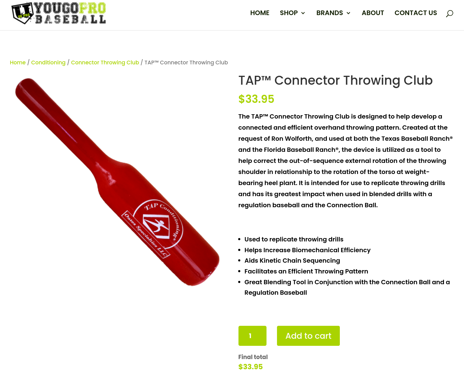
Unlike the other WooCommerce checkout examples on this list, You Go Pro Baseball doesn't add an express checkout option to its product pages. It keeps it simple there:
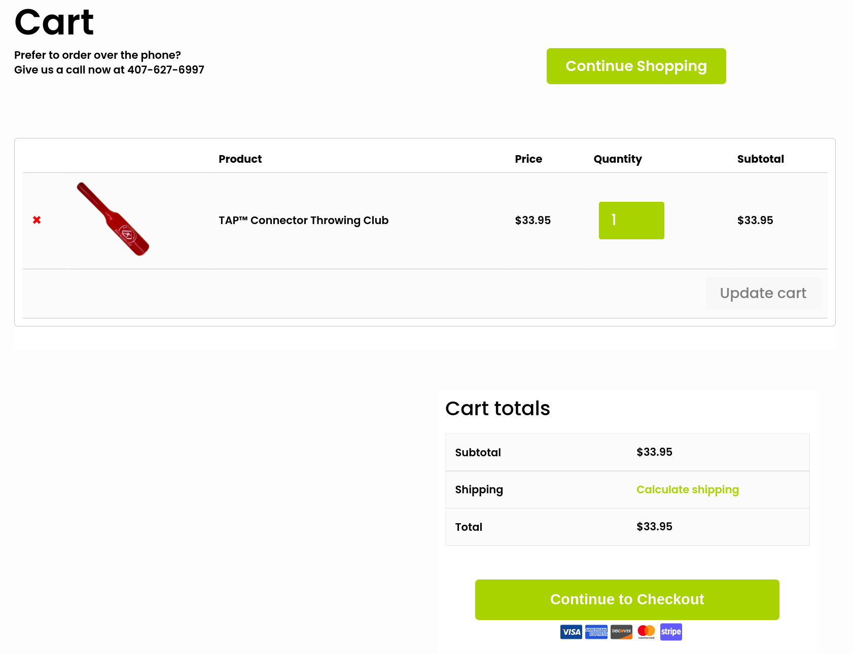
However, when shoppers add an item to their cart, You Go Pro Baseball redirects them to its cart page that comes with PeachPay's Express checkout option.
Clicking the Express option takes new shoppers to PeachPay's checkout window:
You Go Pro Baseball ditched WooCommerce's standard checkout completely and relies on PeachPay to handle all its checkout and payment needs.
As you know, WooCommerce is now requesting its merchants to transition to its new PayPal plugin (PayPal Payments) for the gateway. Support for the current mainstream PayPal integration plugin has already ended.
If you're unsure about how to stably maintain the PayPal gateway on your store, get PeachPay. PeachPay offers a seamless integration with PayPal, and you can rely on it to have your PayPay payments come through. In fact, PeachPay is a great PayPal integration plugin for any WooCommerce store that runs into “PayPal not working” errors. Forget spending hours debugging PHP, just install PeachPay.
A few key takeaways from these top-performing WooCommerce checkout examples
As you can see, each of these checkout processes focuses on the same things:
-
Offering a simpler, faster, and easier checkout experience
-
Offering quicker access to the checkout and eliminating unnecessary steps and page loads
-
Making repeat purchases effortless
-
Eliminating false declines
Also, as you might have noticed, all these WooCommerce stores use PeachPay to power their checkout. While some stores use PeachPay exclusively for checkout and payments, others don’t. Either way, it works just fine. In fact, this is the best part about using PeachPay — it works seamlessly with your existing checkout and payments mix.
Meet PeachPay — the only WooCommerce checkout plugin you need
PeachPay is a multipurpose WooCommerce checkout plugin that lets you add a custom checkout to your store. PeachPay works on every aspect of the standard WooCommerce checkout experience:
-
It replaces WooCommerce's tiring default Woocommerce checkout page with a slick and user-friendly checkout window that looks effortless.
-
PeachPay streamlines the checkout process by reducing the number of steps it takes to get to the checkout — your shoppers can jump straight to the checkout page from your product pages. This can make those quick purchases really quick!
-
PeachPay also helps you skip the cart page step but bakes cart page functionalities right inside the checkout window, so shoppers can easily edit their cart's contents. They can even add coupon codes during checkout.
-
PeachPay offers your returning shoppers Amazon-like one-click checkout experiences where they can complete the checkout with a single click.
-
PeachPay even lets you easily upsell and cross-sell related products right during the checkout.
In addition:
-
PeachPay is an excellent WooCommerce plugin for collecting PayPal and Stripe payments on a WooCommerce store. You also have a support team on standby, just in case.
-
You also get support for wallet payment options — Apple Pay and Google Pay — right out of the box.
-
You can easily style your express checkout button so it matches your WooCommerce theme. You don't have to know any CSS or use additional styling add-ons. Just use PeachPay's styling options. Both the express checkout button and window follow conversion design best practices (including showing logos, seals, and other signals) that reassure shoppers of safe purchases.
In all, with PeachPay, you can replace about half a dozen WooCommerce checkout extensions. Here are detailed tutorials on how you configure PeachPay on your WooCommerce store, including integrations with PayPal and Stripe.
Wrapping it up…
PeachPay helps WooCommerce stores get more sales (by getting more people to complete the checkout), improve the average order value (with upsells/cross-sells), and improve the average customer lifetime value (with a one-click checkout experience for returning buyers).
These WooCommerce checkout examples are from stores just like yours. You, too, can get such tangible results with PeachPay.
So get started with PeachPay today! You don't need to do any custom coding to design a checkout with PeachPay — it's truly plug and play. Sign up now.