How to Customize Checkout Fields with WooCommerce
David Mainayar on | 10 min read
When a user starts checking out from your store but doesn't complete their checkout process, it's called checkout abandonment. Many instances of cart abandonment are, in fact, instances of checkout abandonment. Here, you have users who go so far as to enter their credit card details, set up their shipping information, and even choose a desired delivery date — but abandon your store without buying.
But why do shoppers leave your store after making it all the way through to the checkout? According to one study (by Baymard), about 30% of shoppers abandon a checkout process if it takes too long to complete. And a key reason for this is when an eCommerce store fails to get its checkout's form fields or form elements or, in general, the checkout form right. And understandably so. A checkout process's form sits at the heart of a store's checkout process.
If you're looking to design an optimized WooCommerce checkout process for your store, optimizing your checkout fields is a good starting point. This article will show you how to customize the checkout fields in the default WooCommerce checkout setup and get more people to complete your checkout process. We'll also look at how you can design a more optimized checkout workflow for your repeat customers so that you get more repeat purchases.
A quick look at the default fields WooCommerce checkout ships with
WooCommerce, by default, ships with the following checkout fields:
- Billing details
- First name
- Last name
- Company name
- Country
- Address
- Town/City
- District
- Postcode/ZIP
- Phone
- Email address
- Order notes
As you can see, all the fields most eCommerce stores need to design their checkout experiences are available right out of the box in WooCommerce. Below, you have a default WooCommerce checkout form:
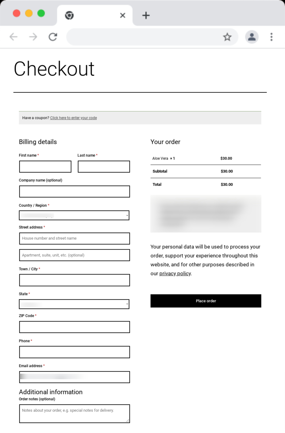
If you show your users this form, it will feel like a lot of work. But most online stores actually use about 11.8 checkout form fields.
A good checkout process, however, should only take about eight fields.
If you review the default WooCommerce checkout form, you'll notice that it uses just eight compulsory fields, so it's already in the "healthy" conversion-friendly range.
Customizing the default fields WooCommerce checkout offers
WooCommerce checkout field customization is mostly not about adding or eliminating fields from the checkout process.
Think about it:
When you sign up a new customer, you need to collect their name and contact information, shipping details, and payment information. You can't eliminate these fields from your checkout form, at least never for your first-time customers.
Also, you don't want to add more fields to such an already long workflow.
That said, you might want to, in some instances, customize your form fields. For example, you might want to hide or delete the Order notes WooCommerce checkout form field. You don't have much use for it if you don't offer order customizations.
Likewise, if you're only starting out you might want to add a simple text field — like "How did you learn about us?"— to your checkout process to learn where your quality, converting leads come from.
You might even need to make a required field optional — making offering the phone number not compulsory, for example. You can probably do with just your users' emails.
At other times, you might want to customize your store's form labels and placeholder texts (although WooCommerce checkout uses intuitive copy for them).
To help you do these, WooCommerce offers [detailed documentation and code snippets.] (https://woocommerce.com/document/tutorial-customising-checkout-fields-using-actions-and-filters/) You can use them to edit its default checkout form field templates. If you know how to code and are comfortable using PHP and CSS, you can easily add, remove, or edit the default fields in WooCommerce checkout.
You can even optimize your default WooCommerce checkout process by getting WooCommerce to fill the state field automatically. For example, if you only ship to a state, you can codify the field, which will get auto-filled for the user. Again, WooCommerce offers documentation support for these.
If you aren't comfortable with coding, you can opt for a WooCommerce checkout field editor extension like Checkout Field Editor. This WooCommerce extension lets you customize your default WooCommerce checkout fields and add, edit, or remove them as needed, but without writing any code.
While customizing checkout fields helps you improve your user experience, it doesn't radically optimize your checkout for more conversions. For that, you need to reimagine your checkout workflow: Think using multi-step checkout forms using only the essential fields, throwing in progress indicators, pitching upselling and cross-selling right on the checkout page, and more.
Instead of only customizing your WooCommerce checkout form fields with a field customizer plugin, use a plugin like PeachPay to do all this and more. PeachPay not only helps you offer simpler and more streamlined checkout experiences to your new users but also makes checking out effortless for your returning customers.
Customizing checkout form fields and going from checkout to Express Checkout with PeachPay
Backed by WooCommerce (Automattic), PeachPay is a WooCommerce plugin that brings more optimized checkout workflows to your WooCommerce store. Here's how.
PeachPay completely overhauls your existing WooCommerce checkout workflow
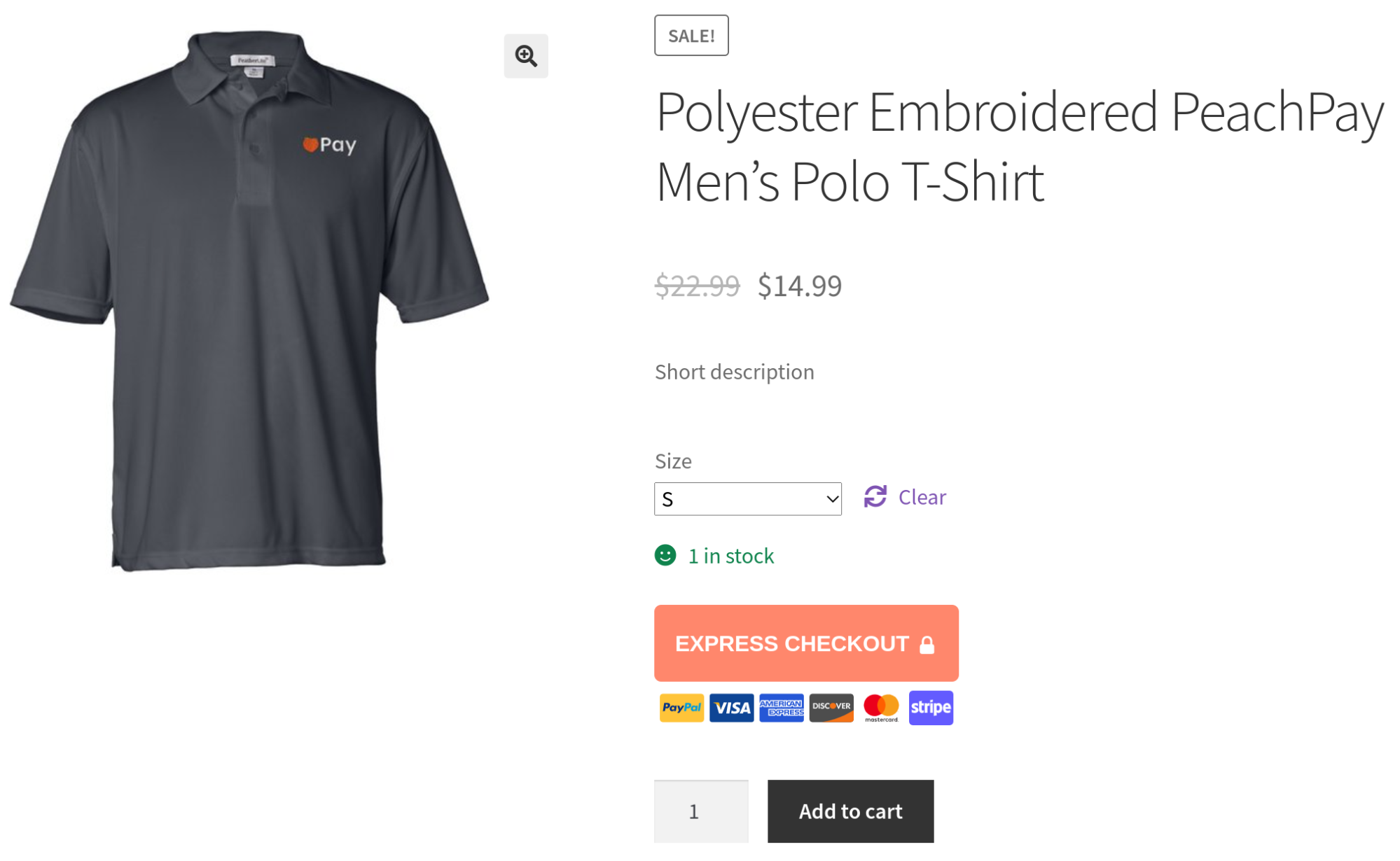
PeachPay adds an Express Checkout button to your store. Below, you have a shopper who is engaging for the first time with a store offering PeachPay's Express checkout:
Notice how:
-
You've got the Express Checkout button stacked neatly right above the Add to cart. You have complete control over your button's size and placement. You also have the lock sign on the button. It serves as a trust seal or validation of a sort — showing that you're going to have a secure buying/checkout experience.
-
Conversion optimizers swear by conversion hacks like displaying the cards you accept on your transactional calls to action. PeachPay brings this feature right out of the box. You can disable it if you prefer.
-
The button's bright orange color coupled with its flash animation instantly draws your attention to the better, faster checkout option it offers. Again, you can turn off the animation if you like. Most of our merchants love it. The button's color and its copy are easily editable too.
All in all, all these visual factors make Express Checkout almost the natural checkout choice for most users.
You can find the customization options for PeachPay's visual interface inside the plugin's Button preferences settings:
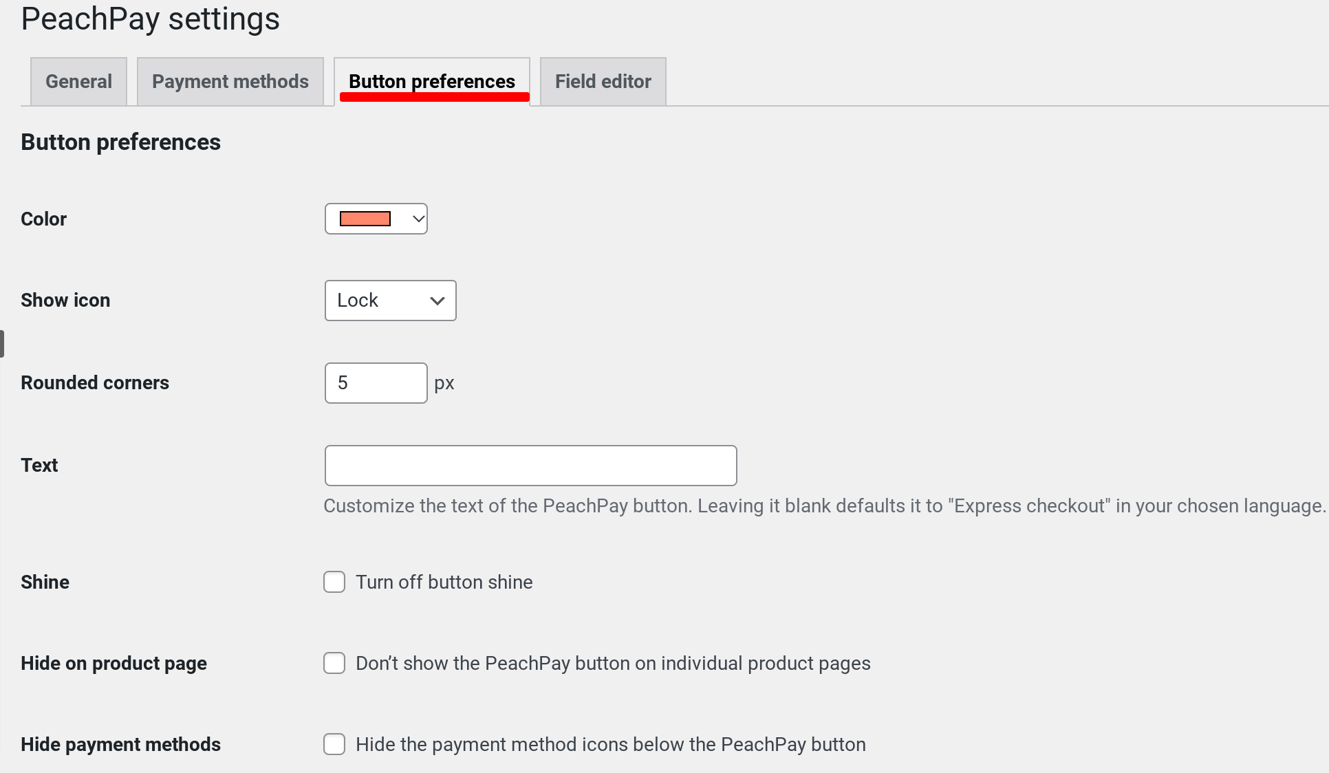
Your product, cart, and checkout pages can each use a different size and placement for the Express Checkout button.
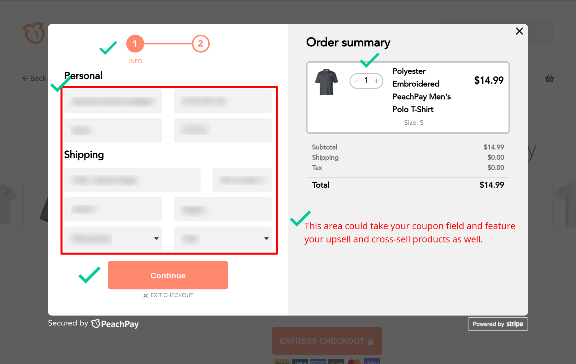
Once a user clicks the Express Checkout button, a super-slick checkout window pops up:
As you can see:
-
The checkout window uses just the correct number of form fields (defaulting at about 10). The two-column display makes the form look really quick, easy, and short, even to new users who need to fill it in entirely (all new users!).
-
You also have progress indicators: You can see there are just two steps to complete to finish the checkout process.
-
The Continue button makes the checkout process even more intuitive.
-
Your order details are available to you all the time in the checkout window. You can even edit the quantity of your cart items using it.
-
If you would have enabled the coupon field for PeachPay's checkout window, that would have shown up here, letting users add their coupon codes and avail discounts right inside your checkout window.
-
Likewise, if you would have enabled upsell and cross-sell promotions inside your express checkout window, your featured products would show up inside your checkout window as well.
PeachPay doubles up as a WooCommerce checkout form field customizer plugin, too.
At PeachPay, we realized that a lot of times when users look for ways to customize their WooCommerce checkout fields, they're mostly looking to eliminate the fields they can do without, namely the coupon and order notes default WooCommerce checkout fields.
To make such editing easy, we decided to include a lightweight WooCommerce checkout form customizer right inside our plugin. With PeachPay's WooCommerce checkout field editing settings, you can quickly delete these two fields from your express checkout window:

Quite a few times, WooCommerce checkout field customization is about adding an additional field like a simple plain text field. Again, to make this easy, our field customizer lets you add text fields to your WooCommerce checkout express window with just a few clicks (without having to write any code):

(More on this below..)
You can find the configuration options for your product upselling, cross-selling, and coupons inside PeachPay's Product settings under the General tab:
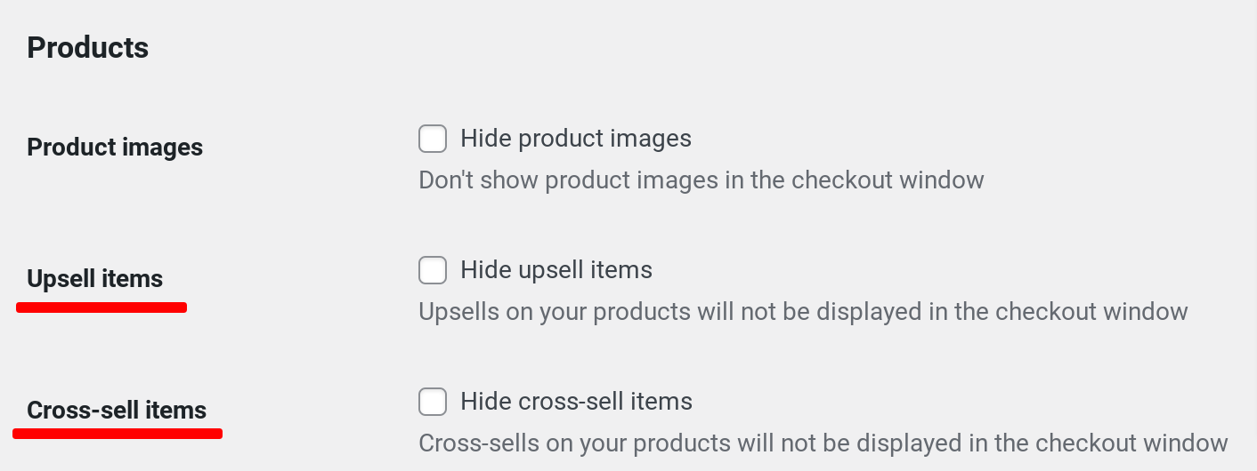
Img: Enabling upselling and cross-selling inside the checkout window

Img: Enabling coupons inside the checkout window
Now see the above screenshot and compare PeachPay's checkout experience with eight fields with the regular WooCommerce checkout experience… What would your shoppers prefer?
Next, as a user clicks Continue, step two of the checkout window shows up:
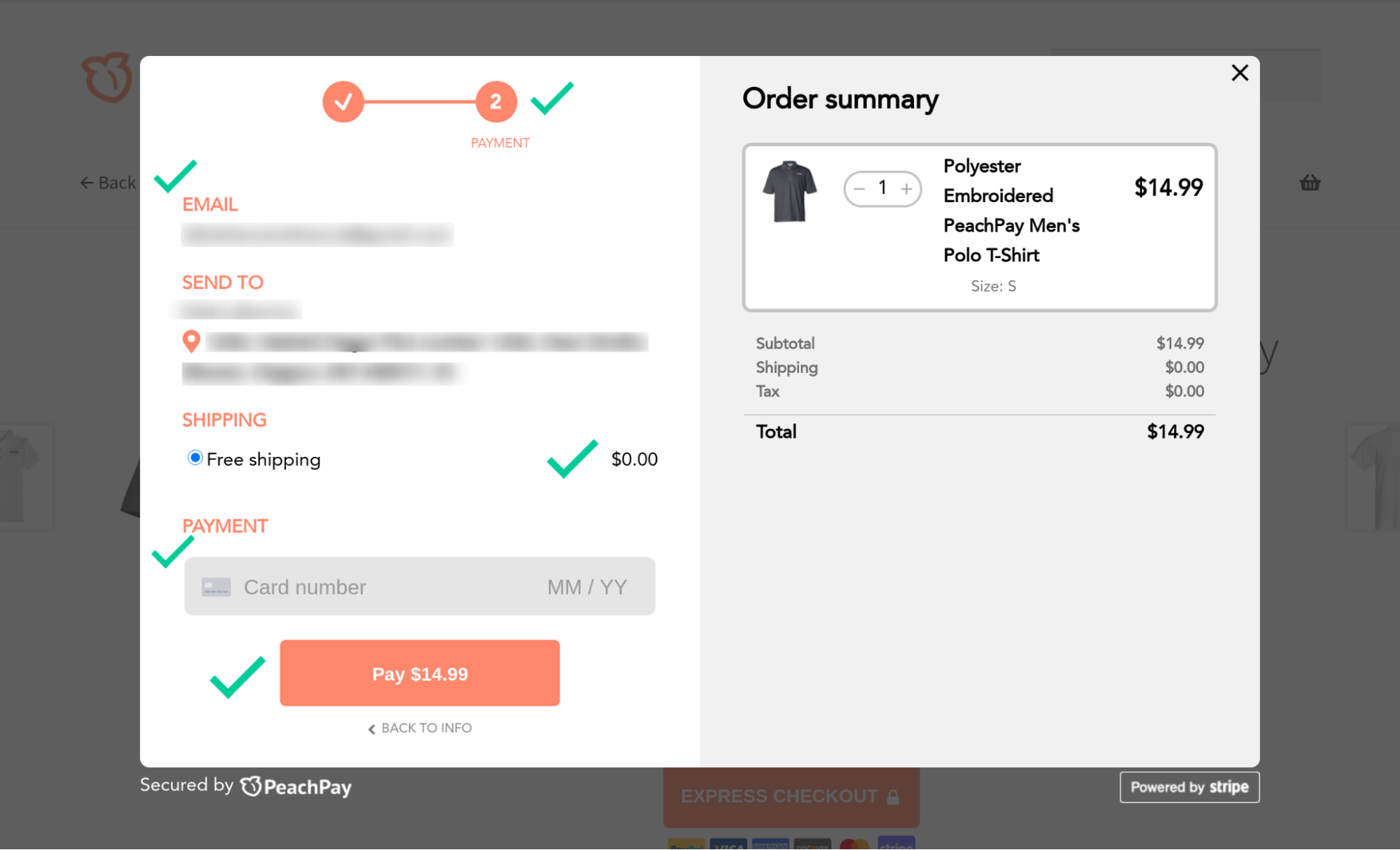
Here:
-
The progress indicator shows that the user is at the checkout process finish line — there's nothing more to do!
-
You've got a quick confirmation on the contact information and the shipping address the user entered.
-
Any shipping fee that a user is charged is displayed clearly, so there's no confusion.
Step two of the Express Checkout window asks for the user's credit card details in a clean one-line field, making it look like very little work.
-
A clean payment button shows users exactly how much they'll be charged.
-
If the user needs to edit their shipping address fields, the BACK TO INFO link takes them to the last step.
Clicking Pay completes your purchase, and you get an order confirmation notification:
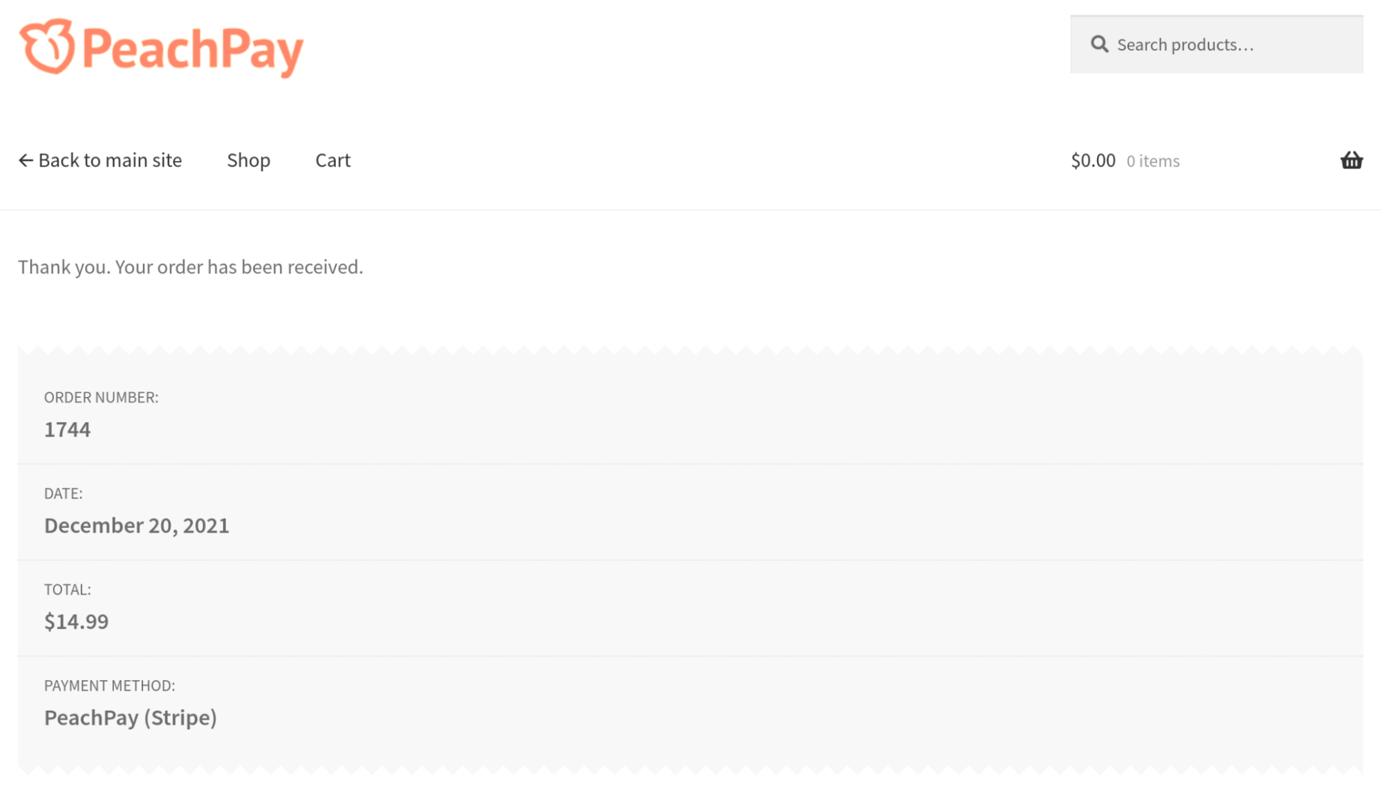
Even with PeachPay's WooCommerce checkout, you get roughly the same volume of work done by your users to complete their checkout process as they would with WooCommerce's default checkout, but PeachPay feels like a lot less work. PeachPay considerably simplifies the checkout experience of your new users and collects all the information you need without overwhelming them.
PeachPay brings 1-click buying to your WooCommerce store
Don't you love it when you return to Amazon to get something, and you don't have to enter your billing, shipping, or payment information every time? It's almost like Amazon REMEMBERS you.
Well, just like you, your users, too, have gotten used to such one-click buying experiences that Amazon pioneered.
As a WooCommerce store owner, you can bring one-click buying to your customers with a solution like PeachPay. When a shopper makes their first purchase on your WooCommerce store, PeachPay notes their billing, shipping, and payment information. Once a user makes a purchase on your store via PeachPay, they never have to re-fill lengthy checkout forms the next time they want to buy something. PeachPay would remember all your customer details so you can offer a seamless "Buy with one click" experience.
Let's now see how PeachPay transforms the WooCommerce checkout experience for a returning user.
When a shopper that PeachPay knows returns to the store and clicks Express Checkout, PeachPay doesn't make them fill out their billing, shipping, or payment method details.
Instead, clicking PeachPay's Express Checkout button automatically fetches all the details they filled in their billing, payment, and shipping fields the first time they purchased, and all they now need to do is click the Pay button:
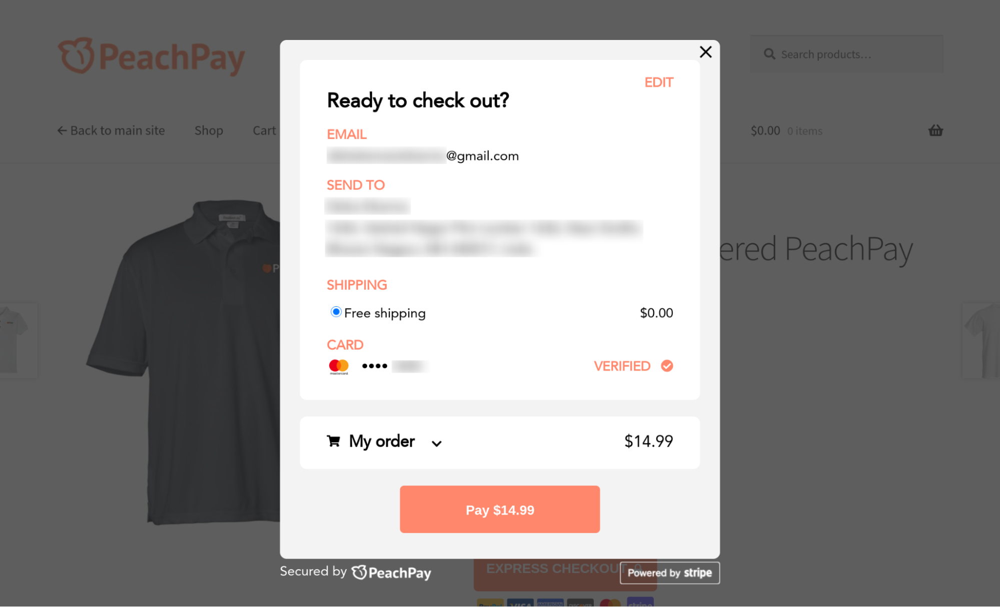
This is truly a one-click checkout experience for WooCommerce.
PeachPay converts all your product pages into checkout pages
Here's what the checkout workflow looks like in a typical WooCommerce store — or in any eCommerce store, in general:
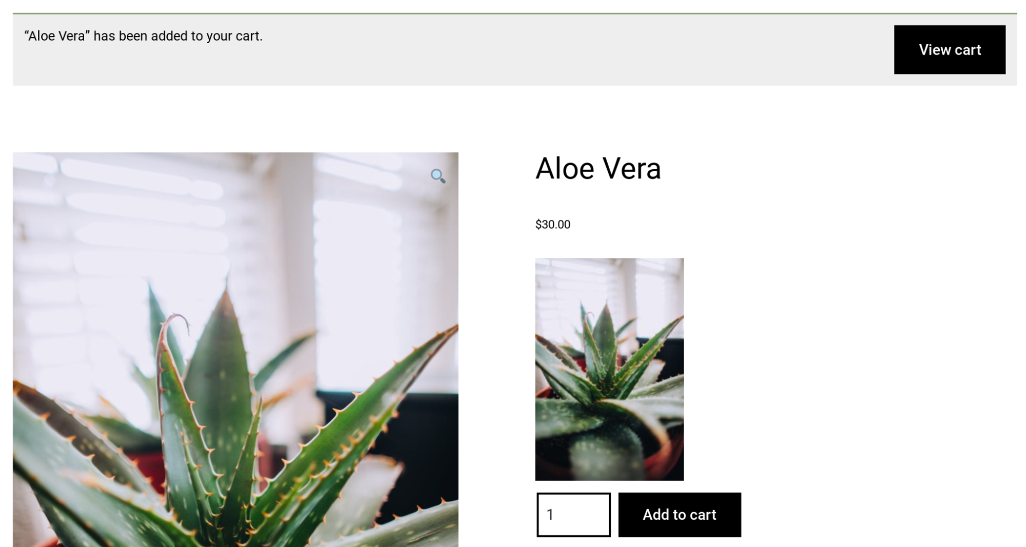
A shopper visits the page of the product they want to purchase and adds it to their cart:

Next, they have to click the View Cart button to access their cart:
Finally, on the WooCommerce cart page, they've to click Proceed to Checkout to begin their checkout process:
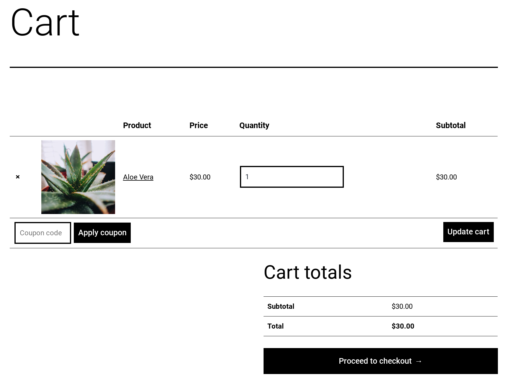
As you just saw, there are three steps to simply get to the real checkout process.
With PeachPay, your product page itself becomes your checkout page, so you can offer your (returning) users a one-click checkout experience from anywhere on your store. Your new users, too, can skip additional clicks (and steps) and start right at the checkout with a single click. Below, you can see how a product page converts into a checkout page with PeachPay's Express Checkout option:

What's more, for repeat customers, PeachPay will have all the billing, shipping, and payment details from their previous purchase — so this is one-click buying straight from the product page.
That's not all: PeachPay helps improve your average order value
You can use PeachPay to feature your upsell and cross-sell product recommendations right inside your express checkout window. This helps boost your average cart value metric. When we studied the performance of merchants using PeachPay on their WooCommerce stores, we found all to report a lower cart abandonment (and a higher conversion rate), an improved average order value metric, and happier checkout experiences.
Why you should use PeachPay to customize your WooCommerce checkout fields
The difference between PeachPay and other form customizer plugins is that with PeachPay, you don't just get to offer your users a more custom checkout experience using fewer form fields but also get to optimize your checkout flow for both your new and repeat customers.
WooCommerce checkout field customizer plugins aren't designed to optimize your checkout experiences for your new or existing customers. While they can add or remove fields from your checkout form, they don't do much to optimize your conversion funnel. Agreed: they aren't even designed to do so.
PeachPay, on the other hand, lets you do both: 1) Customize your WooCommerce checkout fields, and 2) offer simpler checkout experiences to newer customers while making repeat purchases effortless.
A few more plugins for offering optimized checkout experiences
Direct Checkout for WooCommerce
Direct Checkout for WooCommerce (formerly, WooCommerce Direct Checkout) is another WooCommerce checkout plugin that eliminates the step of visiting the cart page in WooCommerce' default checkout workflow.
Like PeachPay, Direct Checkout for WooCommerce adds a Checkout button to the products you enable it for. By clicking this button, your users can jump to the checkout page and avoid the add-to-cart along with the view-cart steps.
Also, just like PeachPay, Direct Checkout for WooCommerce includes a lightweight WooCommerce checkout field customizer. You can use Direct Checkout for WooCommerce to remove your order comments and coupon checkout fields from the plugin's checkout interface. You can also use it to remove terms and conditions and policy text from the checkout process.
WooCommerce One Page Checkout
WooCommerce One Page Checkout is another WooCommerce extension that enables one-page checkout on your store.
Just like PeachPay, this premium WooCommerce One Page Checkout converts all your product pages into a checkout page that users can check out from. If you enable One Page Checkout for a product, WooCommerce adds your default WooCommerce checkout form straight to the product where users can fill in their details and check out:
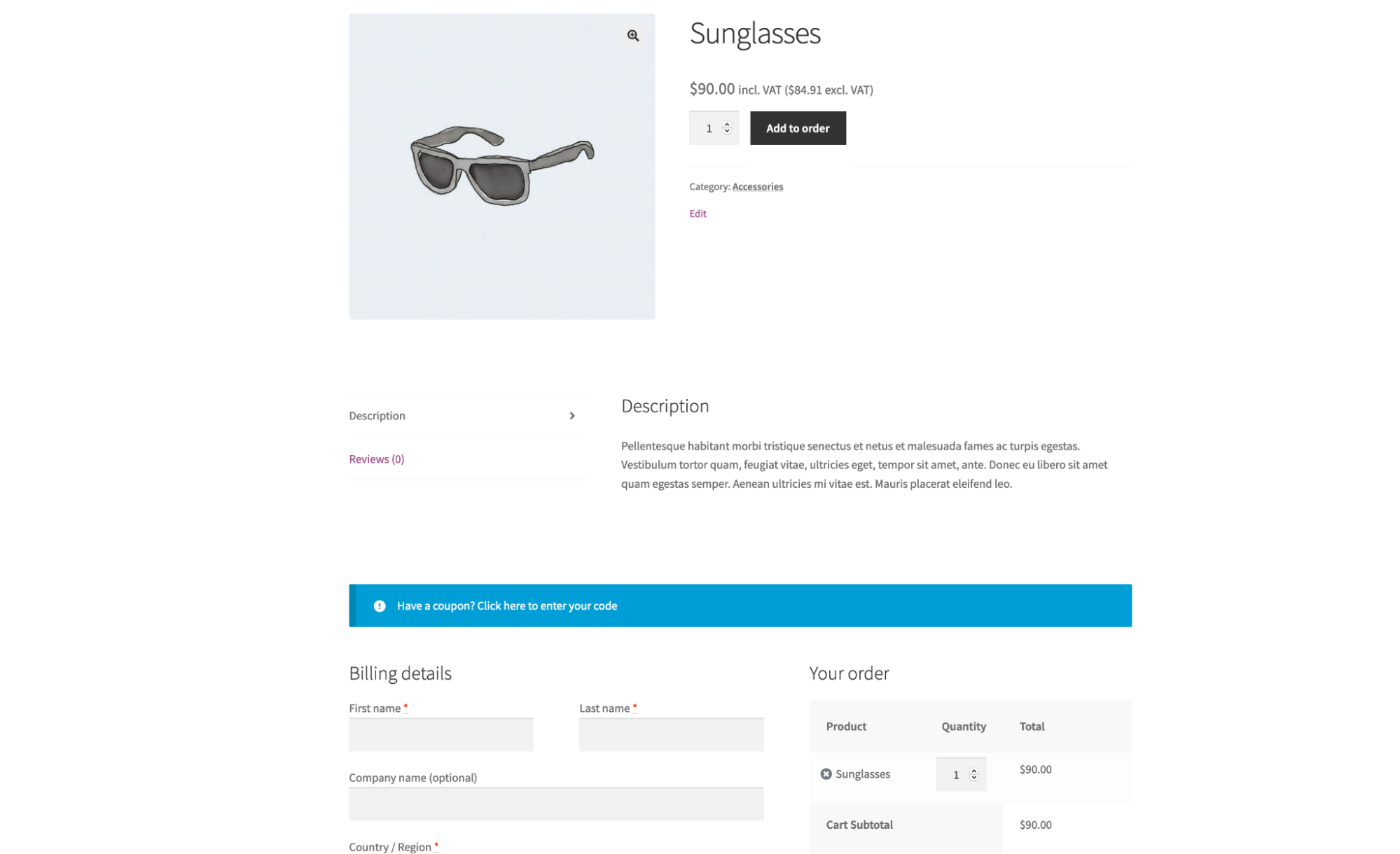
One Page Checkout helps optimize your checkout workflow by reducing the number of clicks (and steps) users need to do to access your checkout. Essentially, it converts WooCommerce's multi-page checkout process to a one-page thing.
You can also use One Page Checkout's shortcodes to embed your WooCommerce checkout form inside your landing pages.
Let's now see how you can use PeachPay on your WooCommerce store.
Getting started with PeachPay
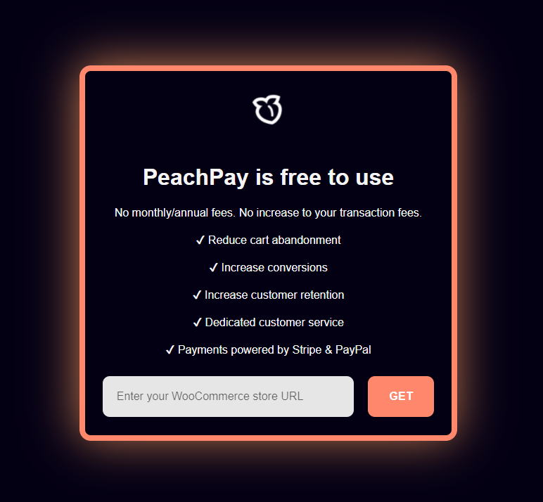
First up, head straight to peachpay.app and navigate to the “Get PeachPay” page.
Enter your WooCommerce store's URL on the following screen and click GET:
Login to your WooCommerce store now:
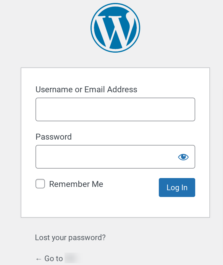
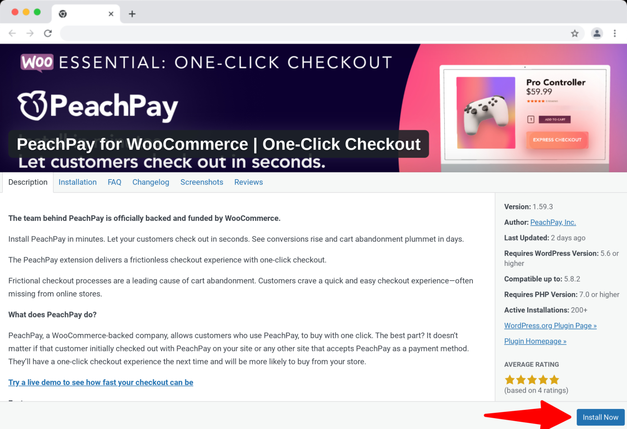
Once you login, click the Install button to install PeachPay on your WooCommerce store:
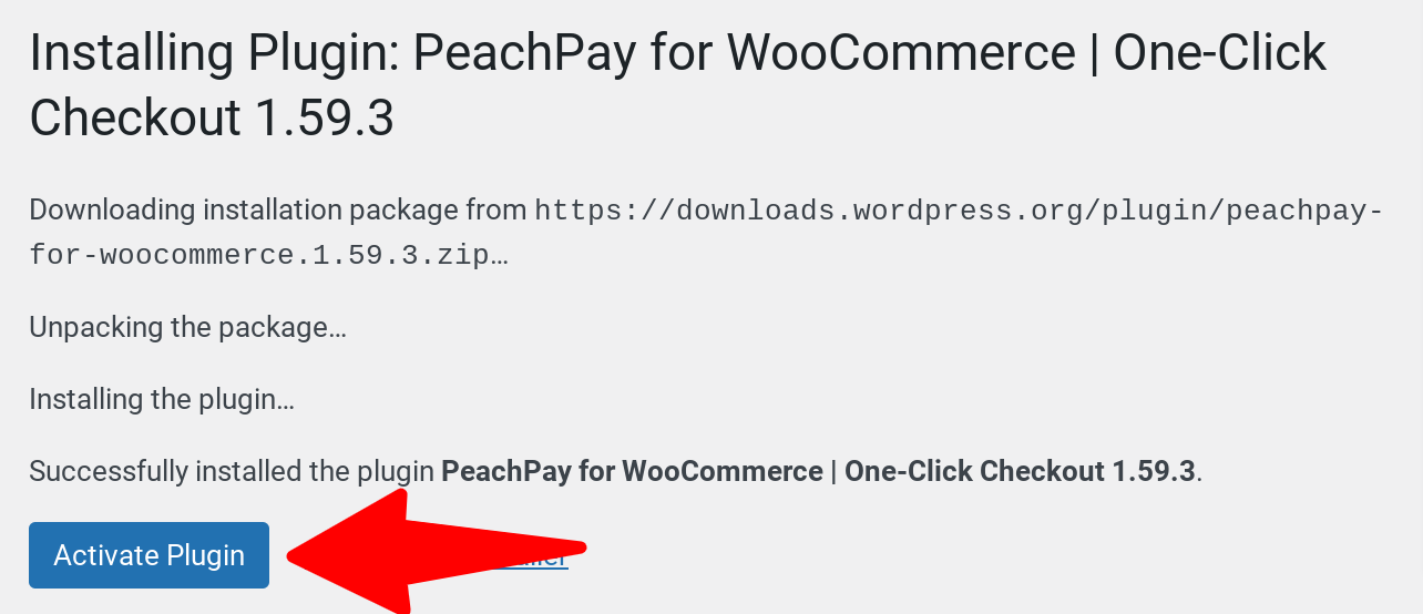
Finally, click Activate:
You should now see a PeachPay tab inside your WordPress dashboard:
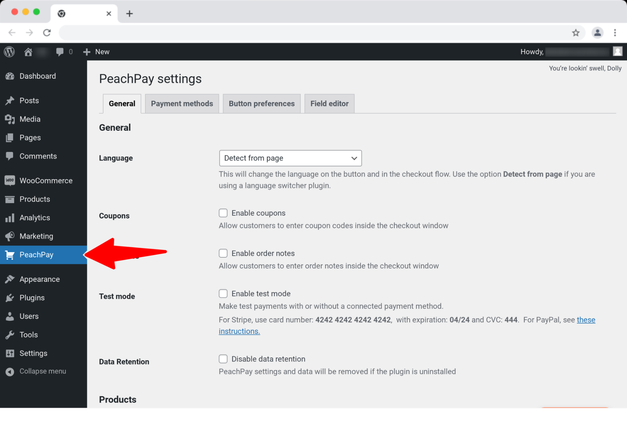
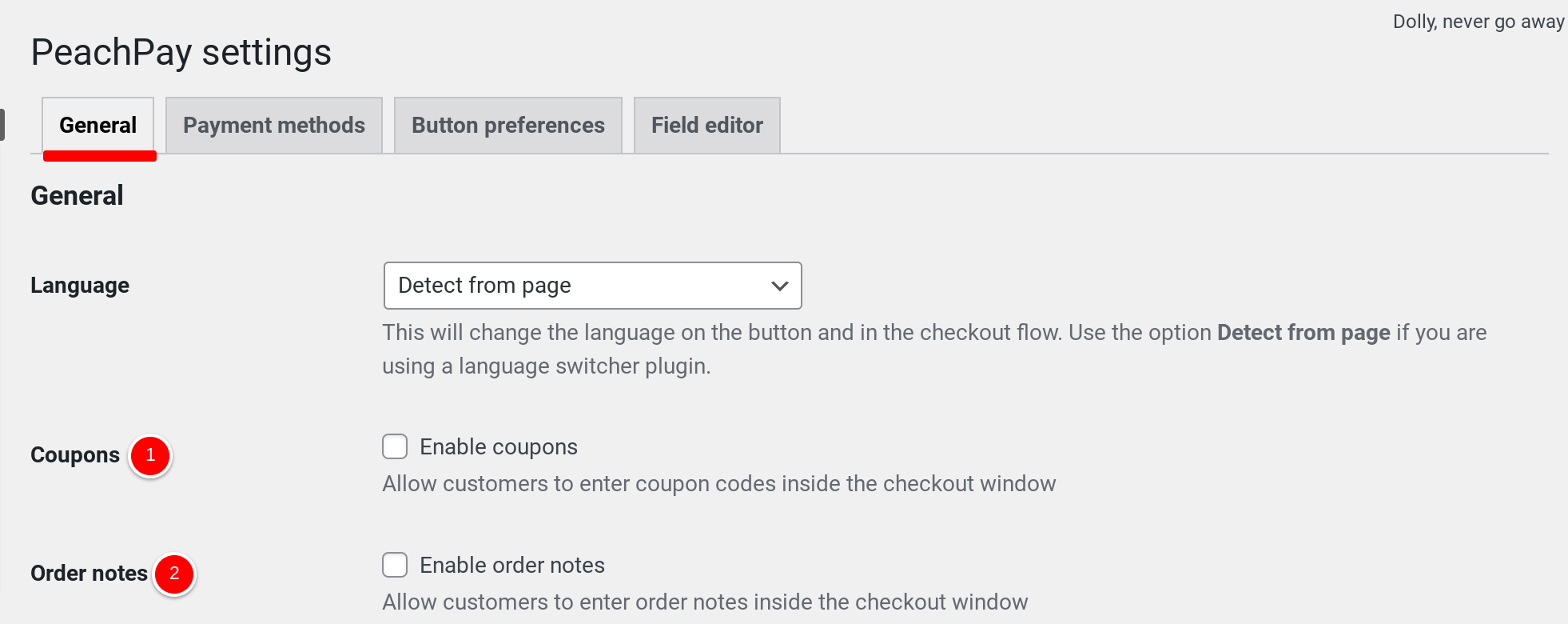
To customize the default fields of the one-click WooCommerce checkout window that PeachPay adds to your store, use PeachPay's General settings:
-
PeachPay disables your one-click WooCommerce checkout window's Coupon field by default. You can enable it by using the Coupons setting checkbox.
-
Peach disables your one-click WooCommerce checkout window's notes field by default. You can enable it with the Order notes setting.
And if you're looking to add a custom field to your WooCommerce checkout window, access the fourth tab Field editor and + Add New Field:
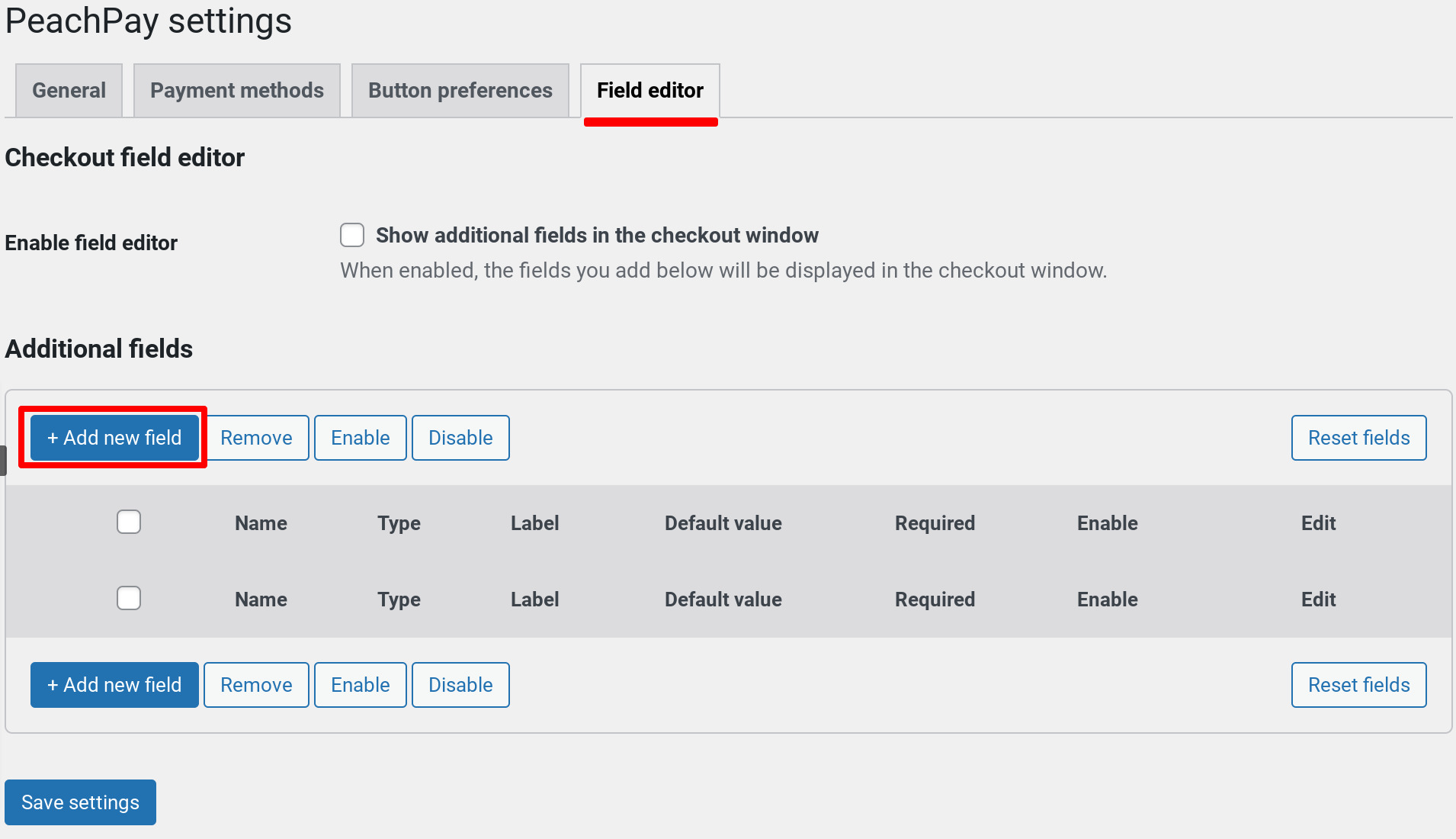
You should see the following popup: (Enter your custom field's details and hit Submit.)
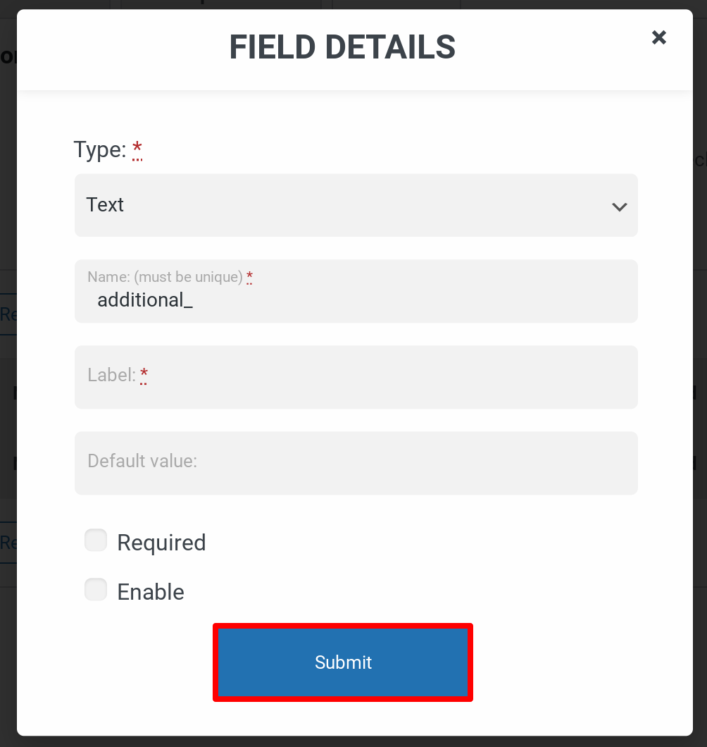
Any custom WooCommerce checkout field you configure here will show up in your express checkout window. And done!
Wrapping it up…
Optimizing your checkout's form fields/elements and its overall workflow are a few sure ways to make your checkout process leak-proof.
As you just saw, PeachPay is a complete solution.
PeachPay doesn't just help you customize the default checkout fields of WooCommerce but also lets you create seamless checkout experiences for new users while making repeat purchases effortless with a one-click checkout. The Express checkout — or the one-click buying option — that PeachPay adds brings to your checkout workflow eliminates almost the entire checkout form from your repeat customers' buying journey.
What's more, PeachPay's Express checkout works seamlessly on product, cart, and checkout pages. So users can checkout with a single click from anywhere on your store. PeachPay works seamlessly with payment gateways like PayPal and Stripe. Also, it plays well with WooCommerce themes (and even child themes). PeachPay integrates well with most WooCommerce plugins, so you shouldn't face any compatibility issues.
Take PeachPay — a WooCommerce-backed one-click checkout solution — for a spin today and see how you can offer friendly user checkout experiences to your new and repeat customers.
Table of contents
-
A quick look at the default fields WooCommerce checkout ships with
-
Customizing checkout form fields and going from checkout to Express Checkout with PeachPay
-
PeachPay completely overhauls your existing WooCommerce checkout workflow
-
PeachPay converts all your product pages into checkout pages
-
That's not all: PeachPay helps improve your average order value
-
A few more plugins for offering optimized checkout experiences